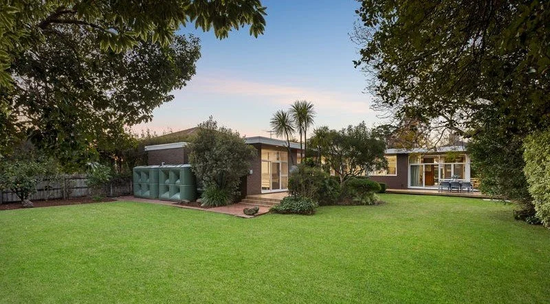
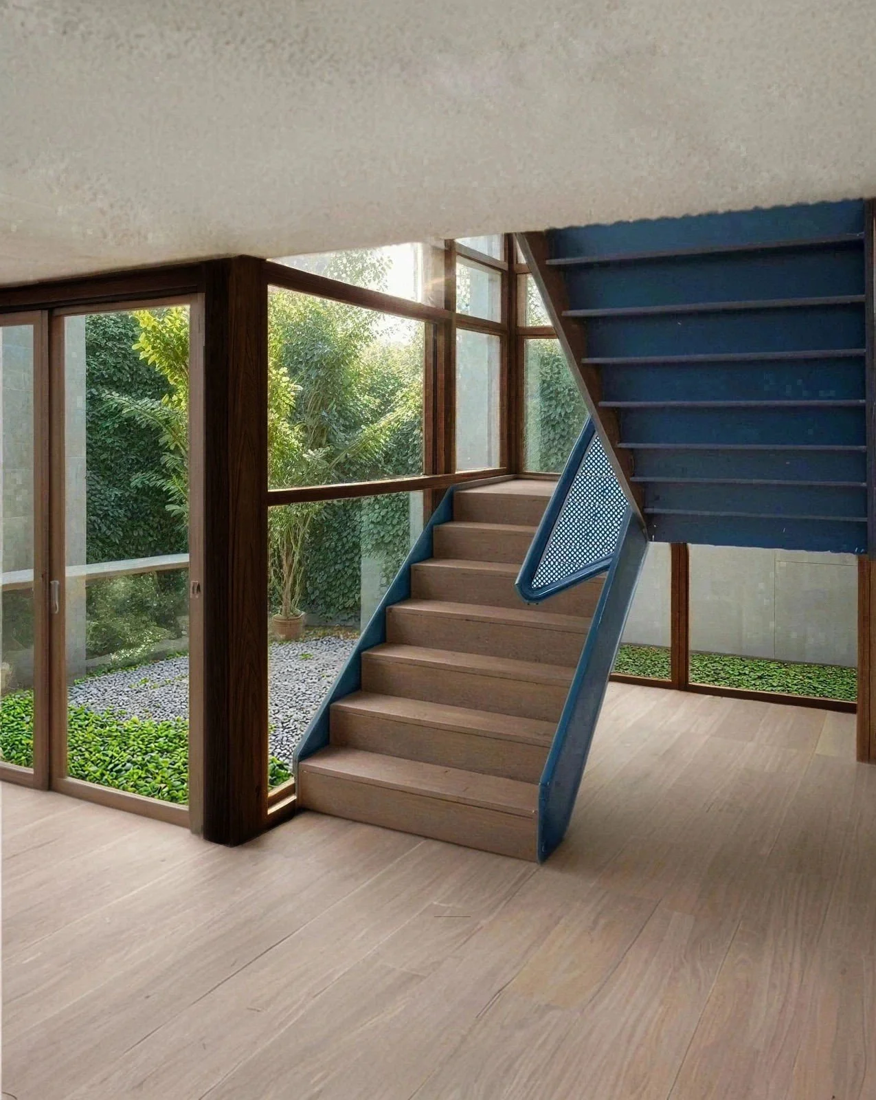
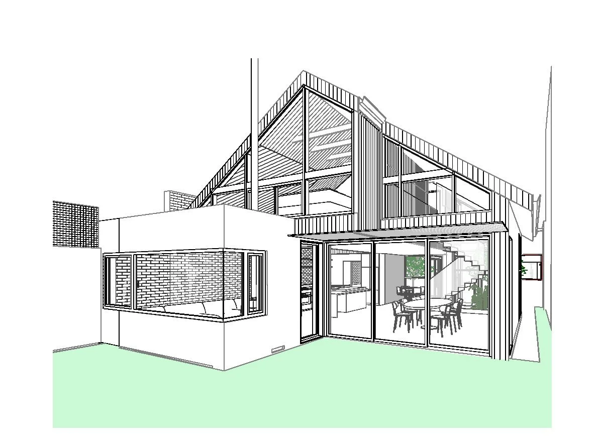
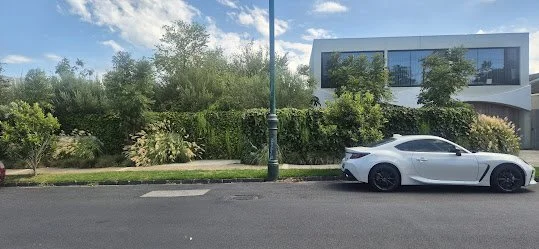
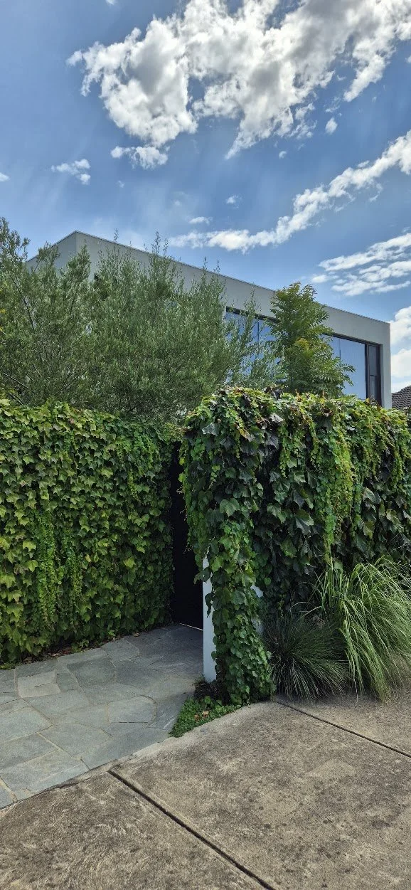
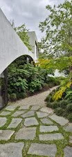
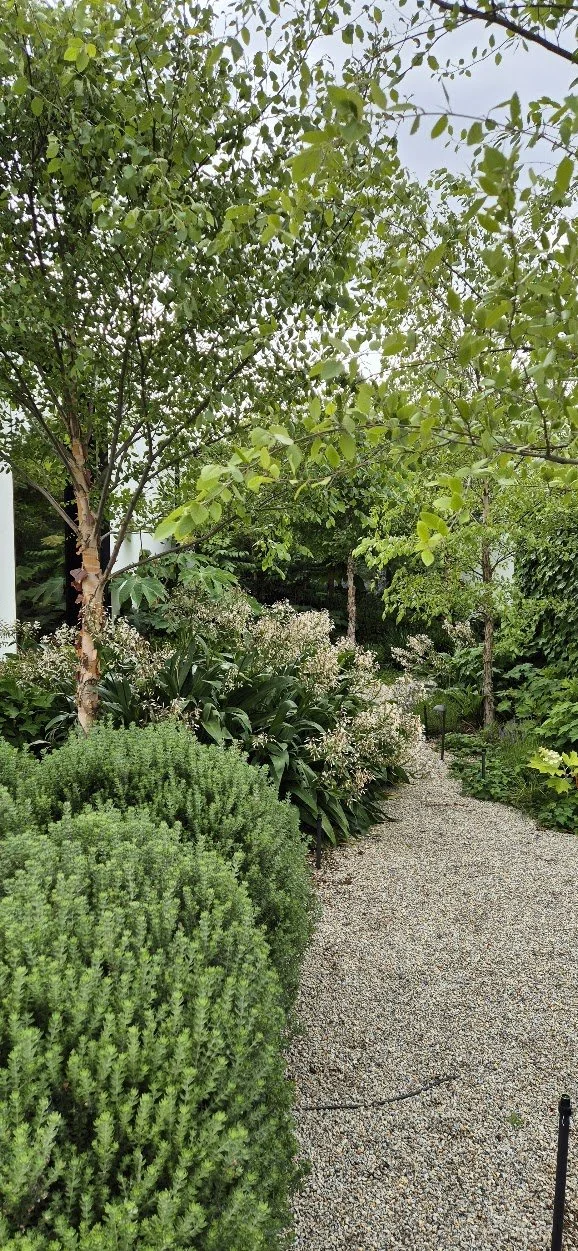
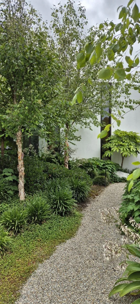
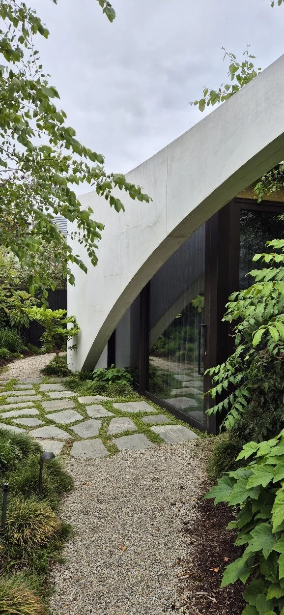
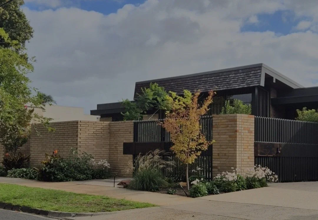
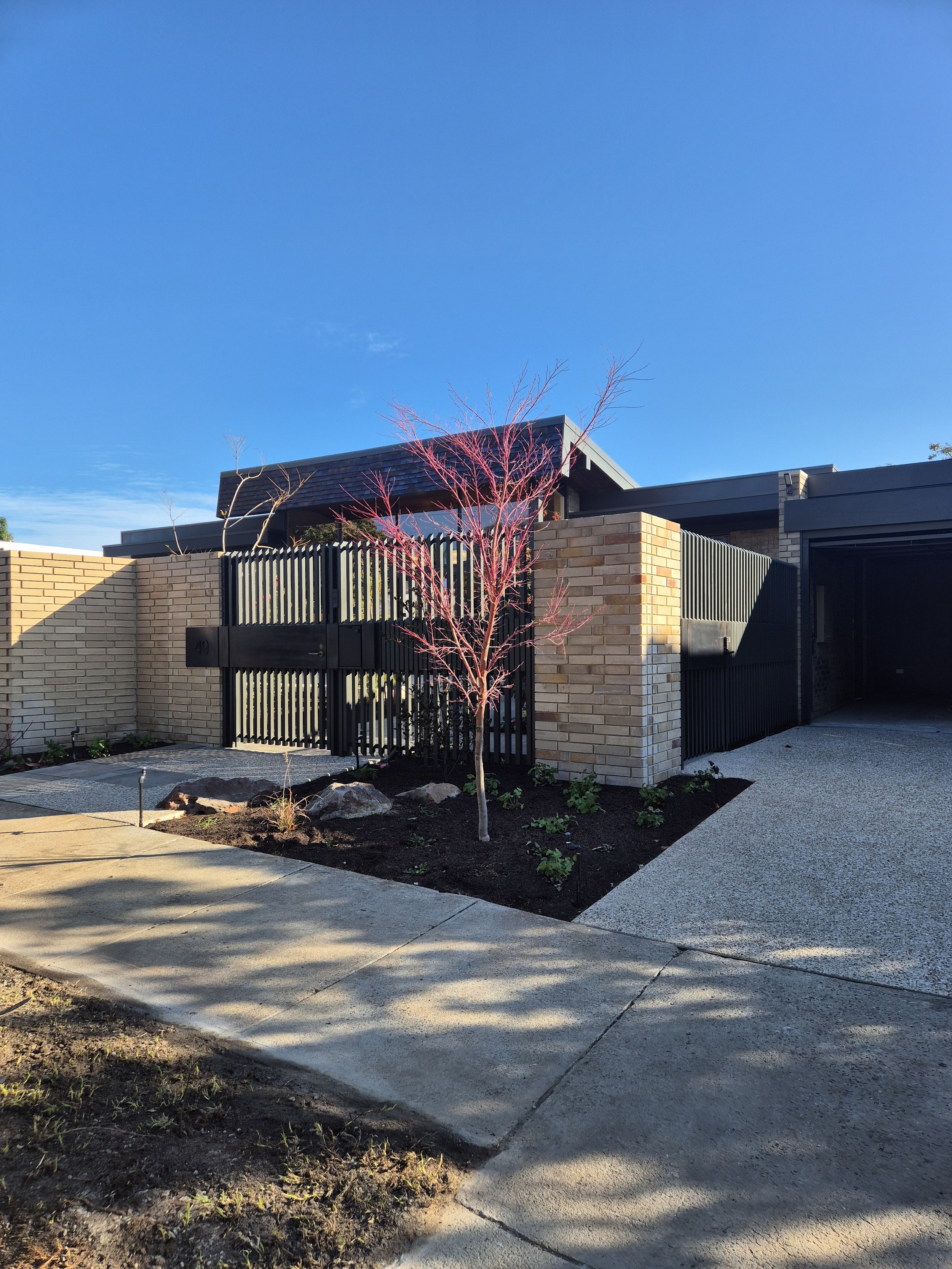
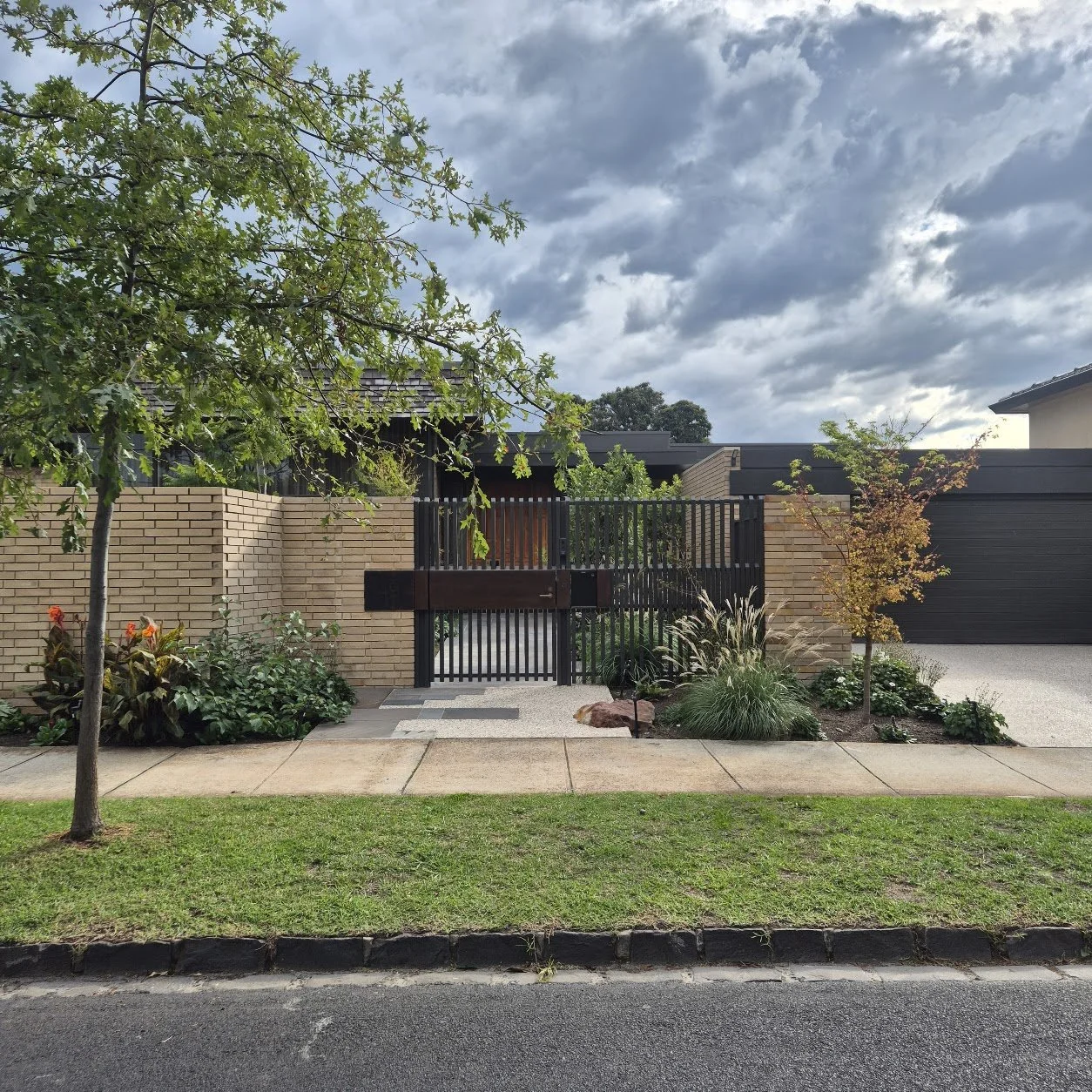
The mid-century modernist houses of Caulfield occupy a peculiar position in Melbourne's architectural story. Not the headline act. That went to Boyd, Grounds, Seidler. The Caulfield group were the emigres: Fooks, Kagan, Feldhagen, Kaldor, Rosh. They arrived carrying Europe with them, settled quietly, and built brilliantly. What they left behind still reads as entirely current.
THE EMIGRE SENSIBILITY
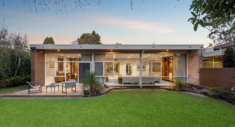
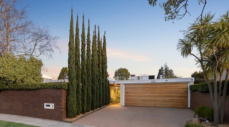
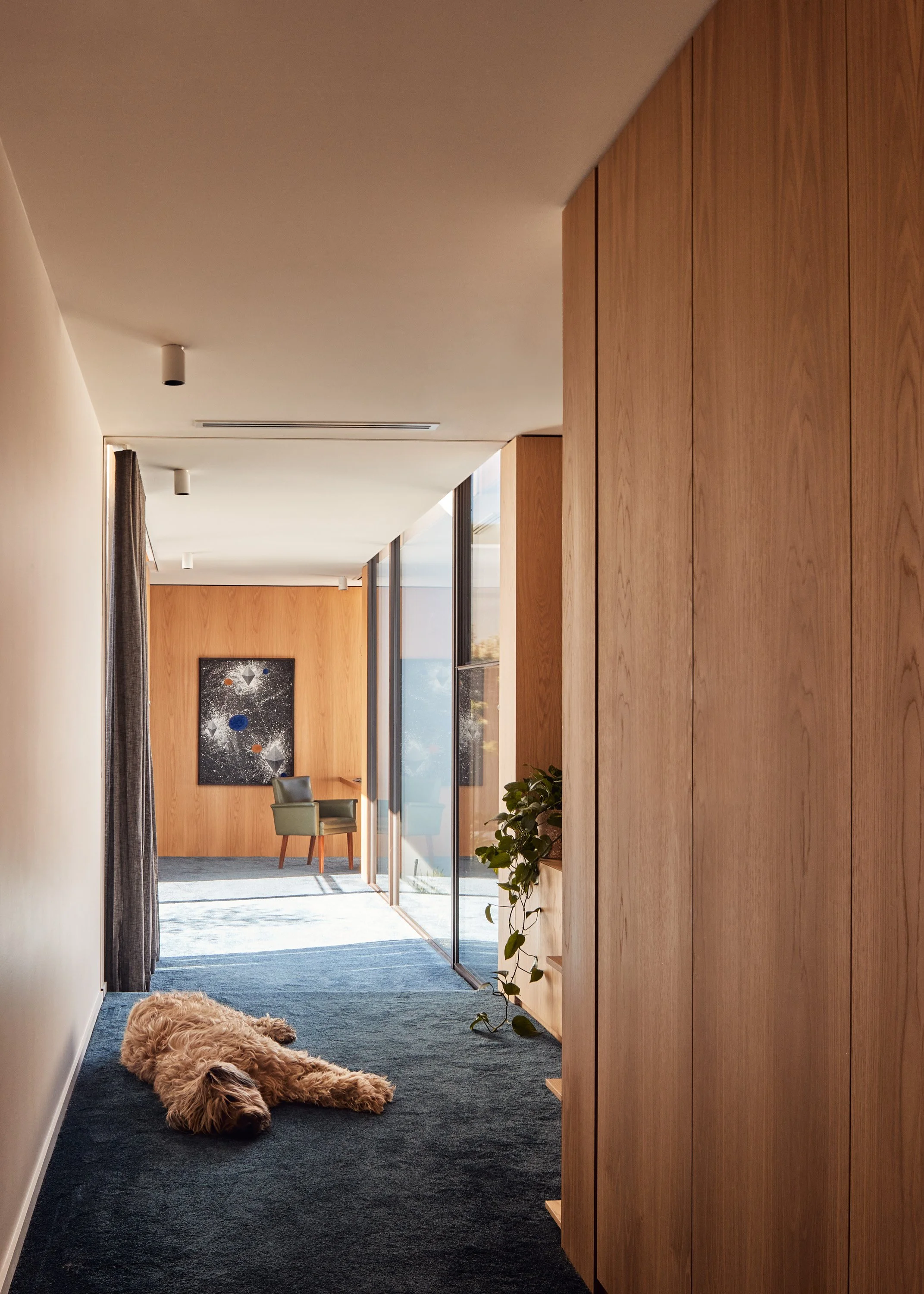
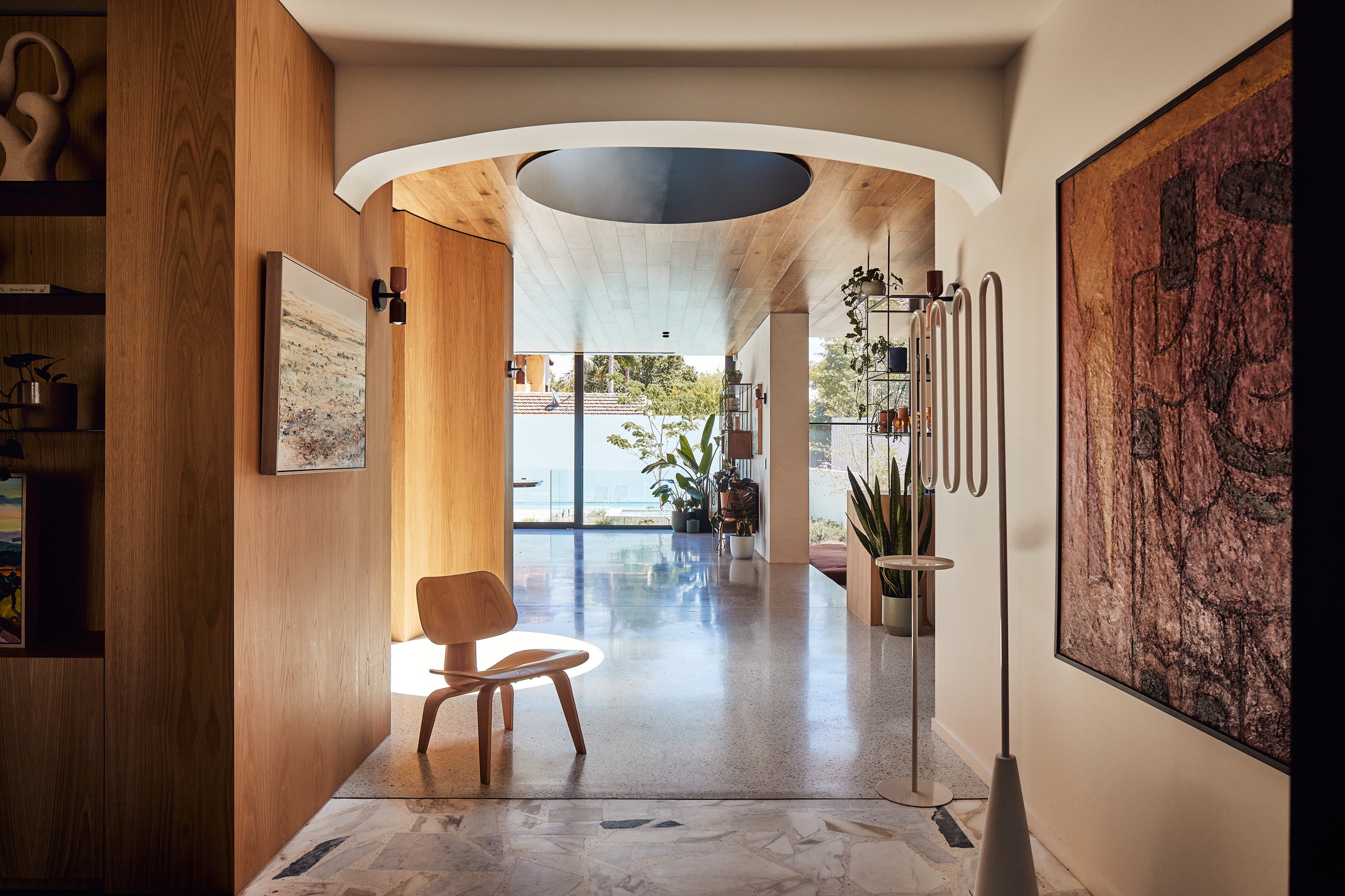
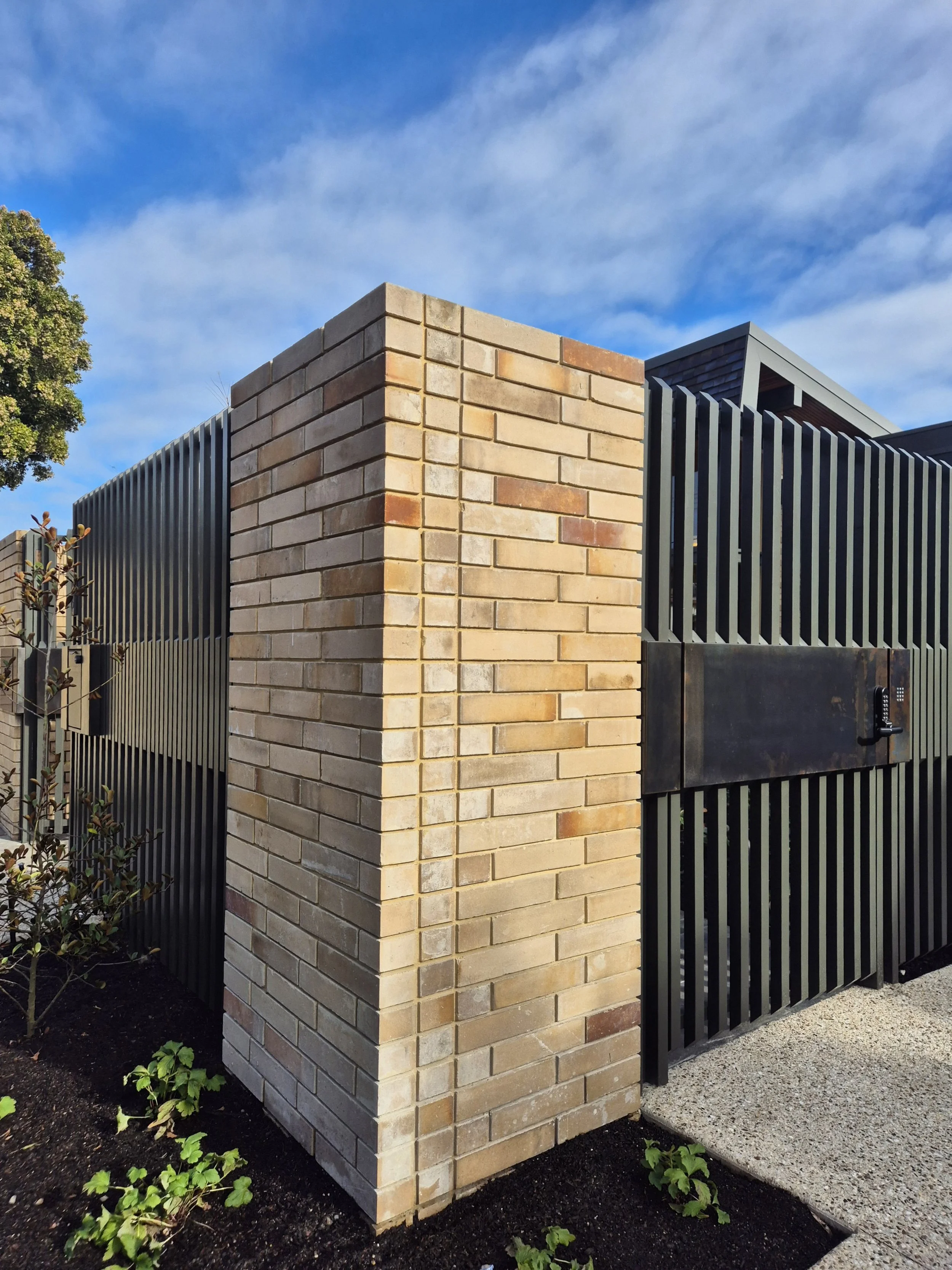
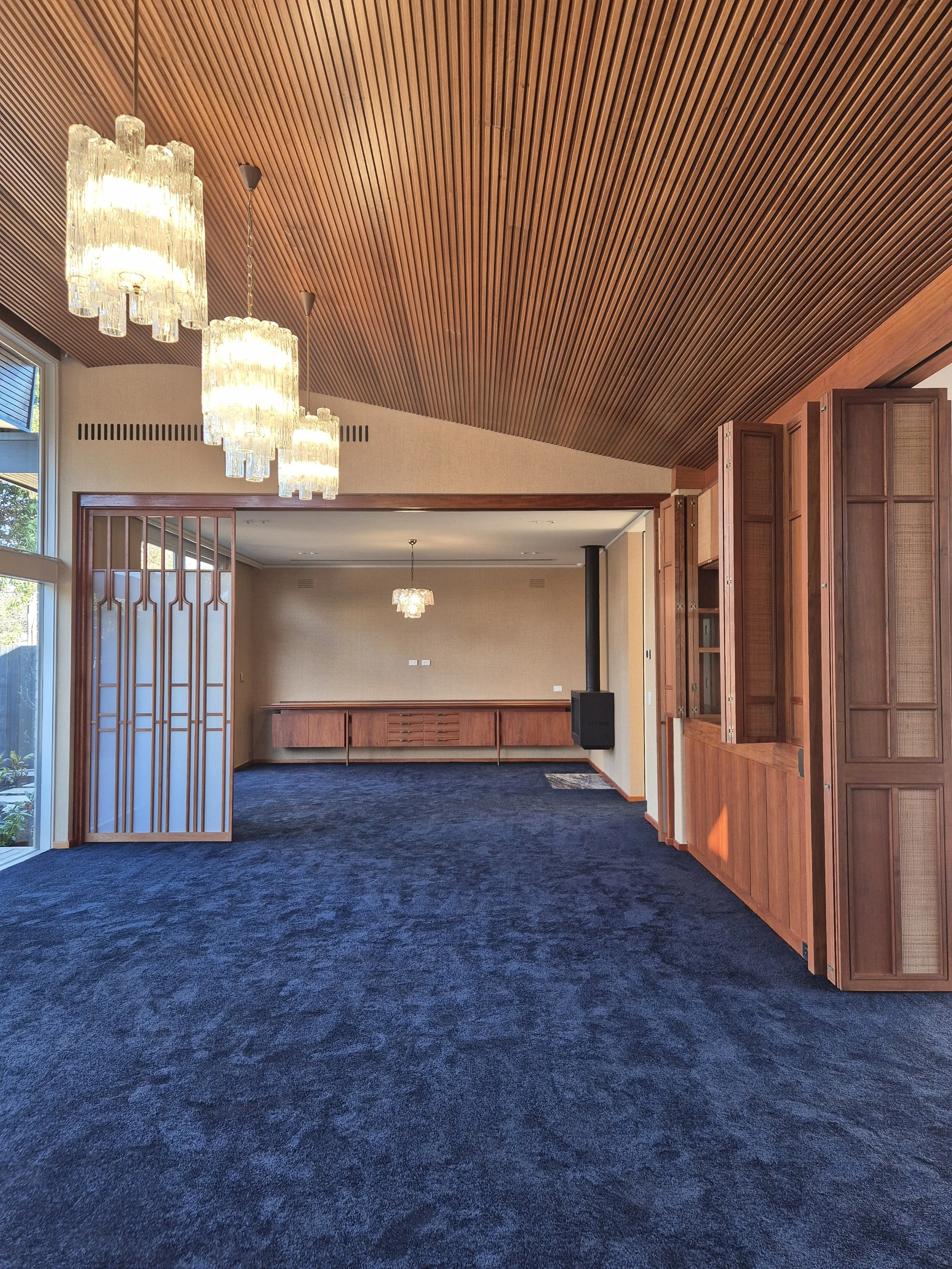
These practitioners worked predominantly in Caulfield through the 1950s and 1960s. The work was grounded in the International Style but it wasn't austere. Exposed and textured brickwork, terrazzo, marble, patterned surfaces, custom-built timber joinery and furniture. Rigorous spatial thinking and material richness in the same breath. That combination is precisely what contemporary high-end residential design is reaching for right now. Ernest Fooks is the most layered example. His own house, designed in 1964 for himself and his wife Noemi, synthesises Scandinavian, European and Japanese spatial thinking. European logic meeting Japanese restraint and material honesty. That is not a period curiosity. It is the language that the best contemporary residential architects are still working in. His mature work was characterised by efficient structural forms, a reduced material palette, generous glass and elegant detailing. His earlier work was bolder: box-like masses projecting and receding, solids and voids in brick and feature stonework. The tension between those two impulses, bold massing against restrained detail, is what keeps the houses feeling unresolved in the best way. They still ask questions.
THE COURTYARD IDEA
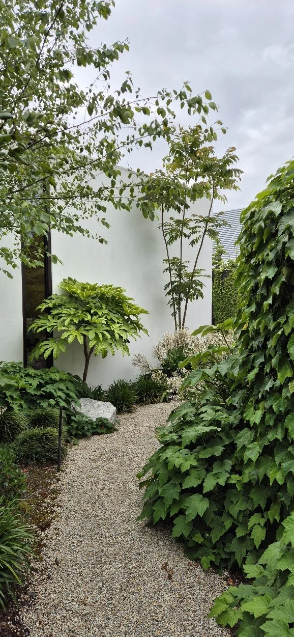
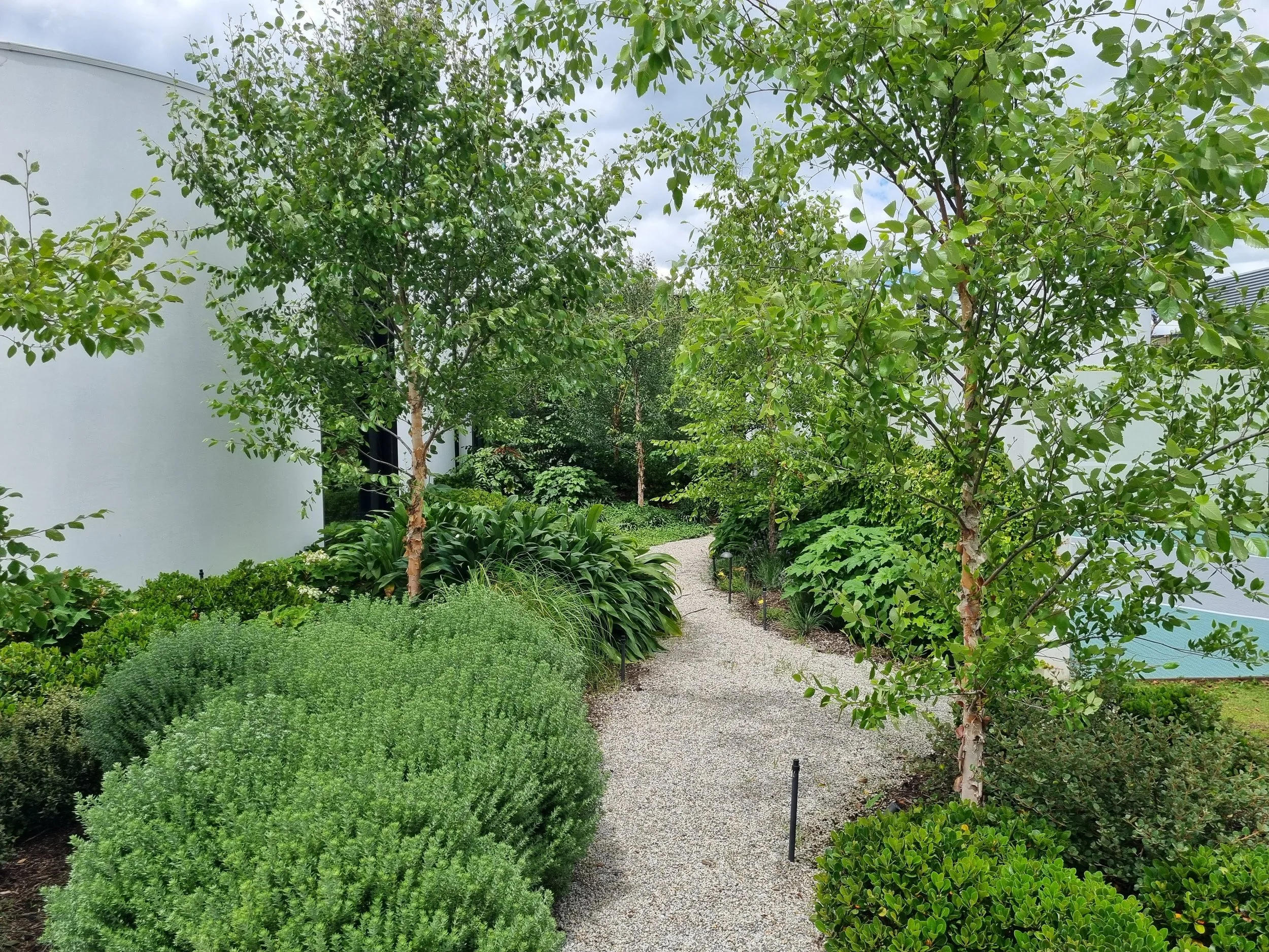
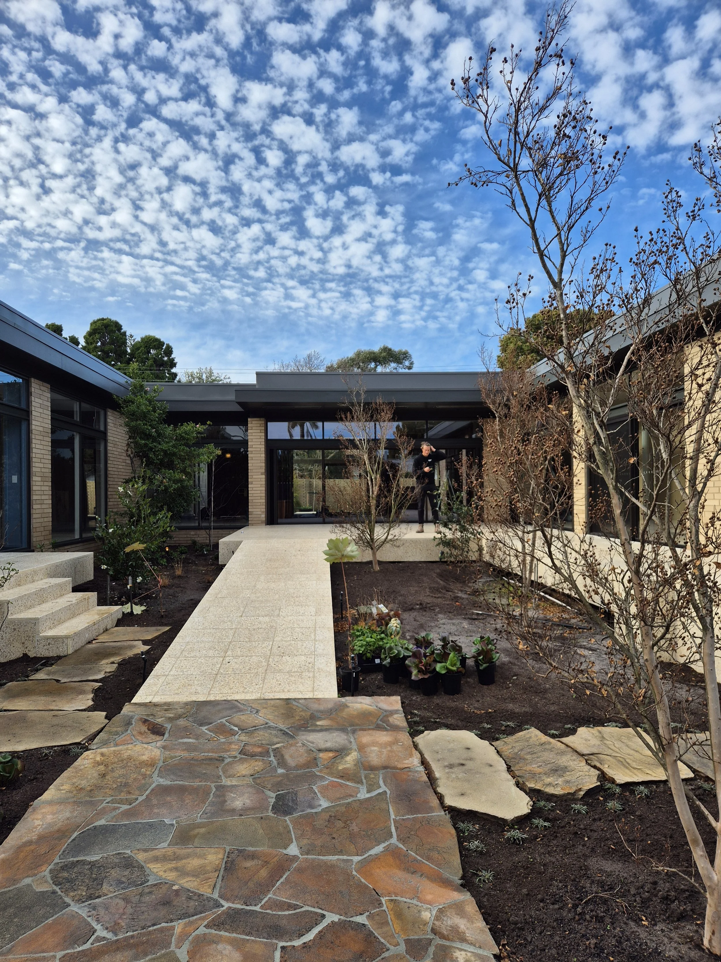
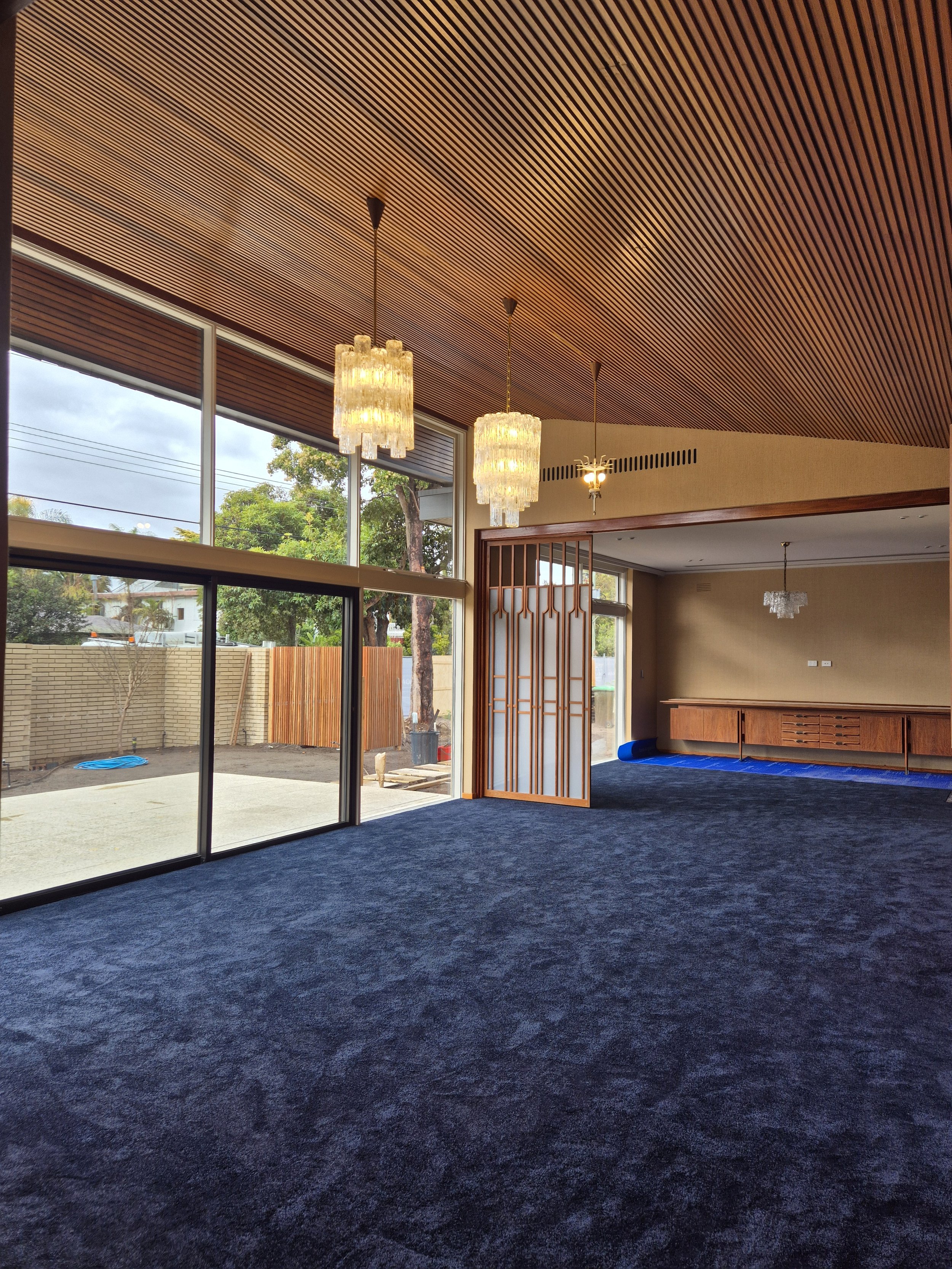
The courtyard is where it gets interesting. The Caulfield modernists didn't use courtyards as amenity. They used them as the structuring device. The thing the domestic plan organised itself around. Mies van der Rohe had been working through this from the 1930s, and it fed directly into the Bauhaus diaspora that brought these architects to Melbourne. The idea was ancient in origin and radical in application: create a boundary, contain landscape within it, dissolve the interior and exterior distinction entirely. Mies rejected enclosed rooms and relied on glass to break down the threshold. The courtyard made that possible at a domestic scale, on a suburban block. It gave privacy while demanding openness. It brought the garden into the plan rather than appending it to the rear. The Fooks house is the courtyard idea fully realised. Modernist but richly detailed. Japanese influences throughout. Built-in screens and furniture, a wavy timber ceiling, a skylight with shades of Aalto. Spaces that flow from one to the next with every inch of the site designed, from the pebbled front path to the pergola behind the pool. House and garden resolved into a single inhabited surface.
WHY IT'S STILL CURRENT
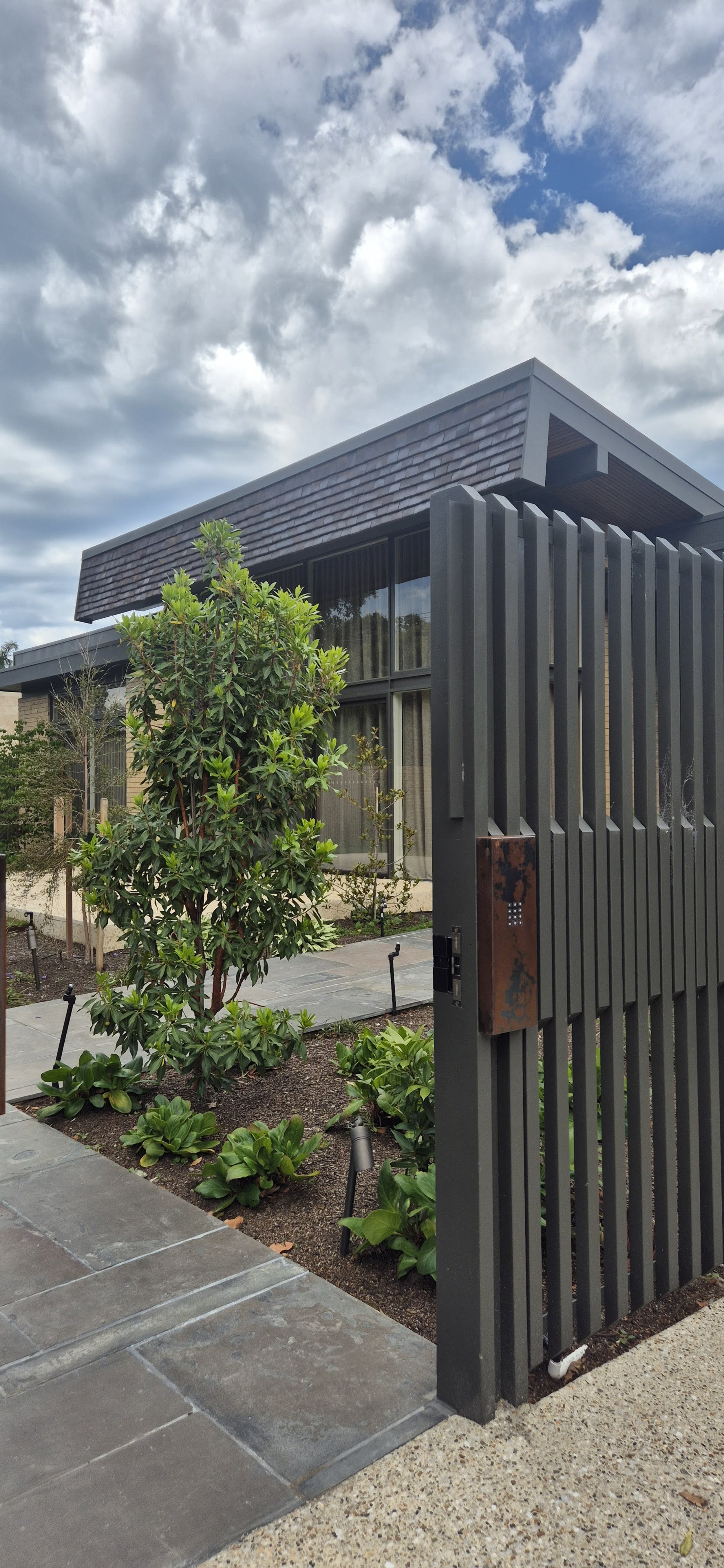
Contemporary residential design is circling back to exactly this. The best high-end briefs now ask for the same things the Caulfield modernists were answering sixty years ago. Privacy from the street. Connection to planted space. Enclosure that doesn't feel enclosed. The garden as a room. Living spaces that extend outward rather than terminate at a wall. Powell and Glenn's Silhouette House in South Yarra demonstrated it recently. Landscaped courtyards distributed through the plan, every main living space engulfed in foliage. The heritage modernist fabric and the contemporary intervention share the same spatial DNA. That continuity is not accidental. Bower Architecture's renovation of a 1960s Caulfield home was described as New Modern. The term is telling. Not nostalgia. An acknowledgement that the original ideas haven't been surpassed. They've been waiting for the culture to catch up. The Caulfield modernists worked with constrained suburban lots, modest budgets and no heritage protection to guarantee their work would survive. The spatial intelligence they brought from Vienna, Prague and Berlin, filtered through Japanese spatial philosophy and an Australian climate, produced houses that still set the brief for what a resolved home should feel like.
The courtyard is still the most civilised thing you can put in a house. They knew that in 1956.
Some clients arrive with a brief. Others arrive with a vision. And occasionally, someone walks through a door and sees not what a building is, but everything it was and everything it could be again.
This was one of those clients.
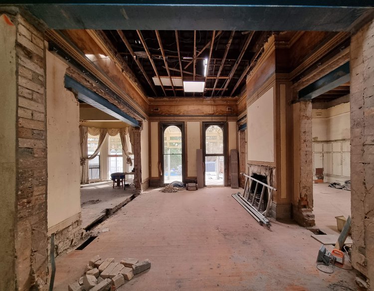
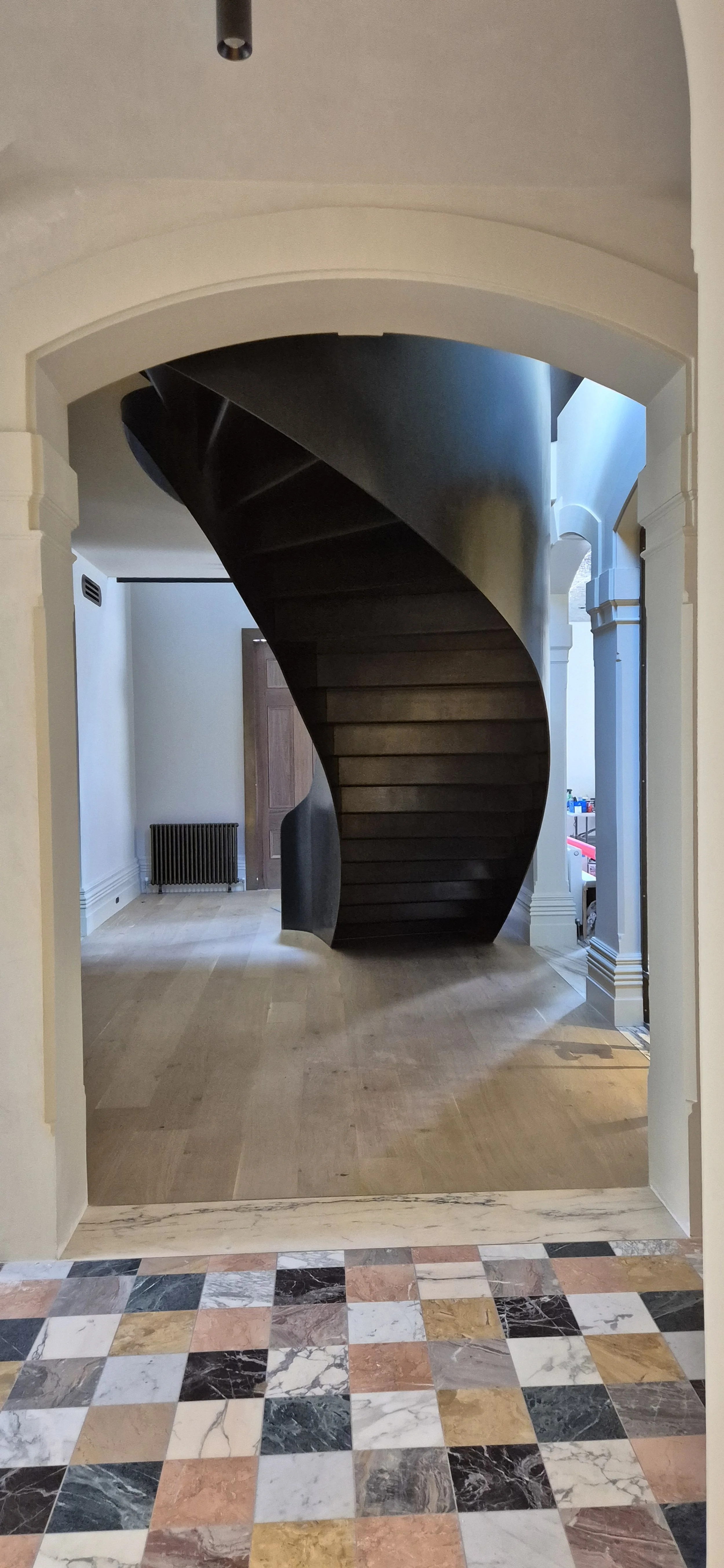
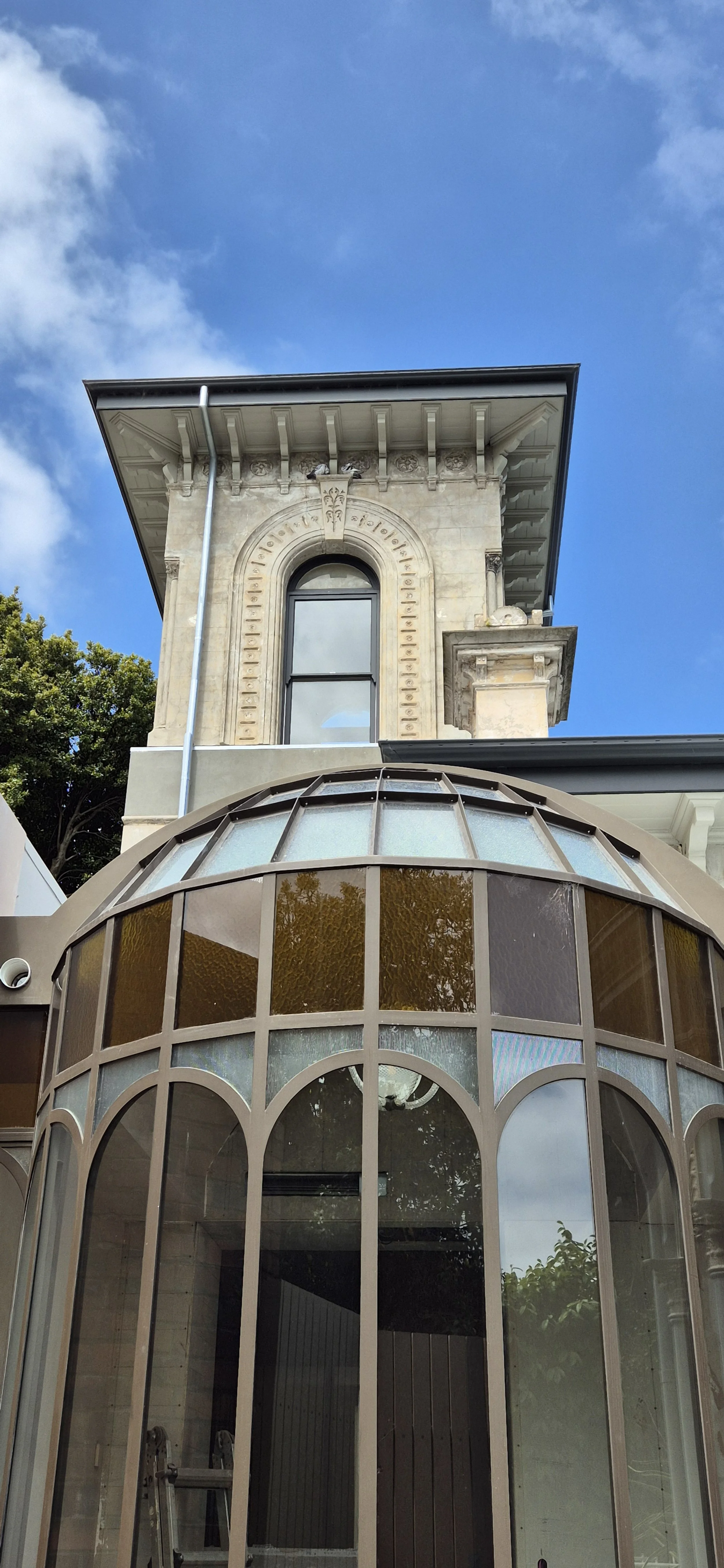
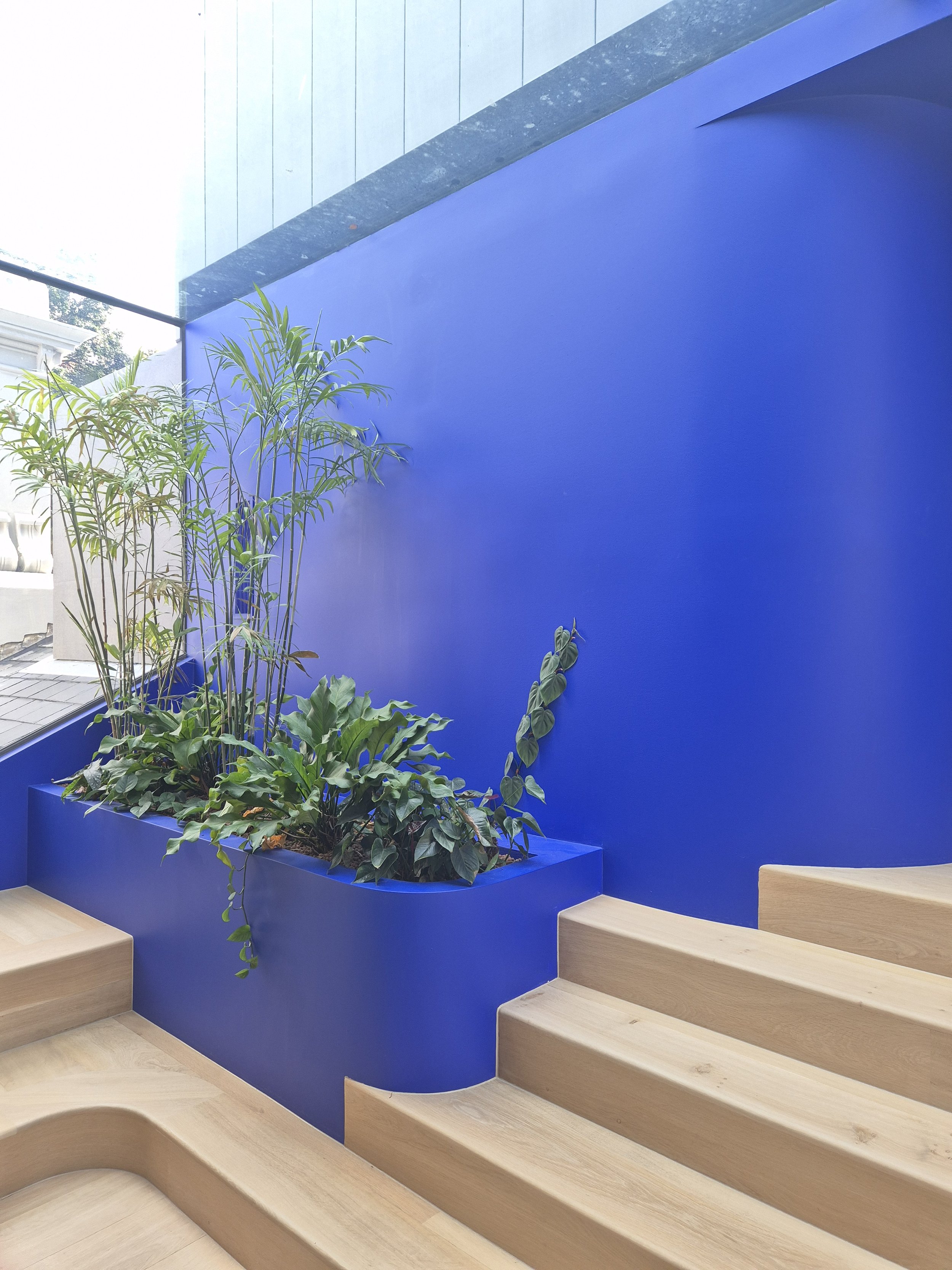
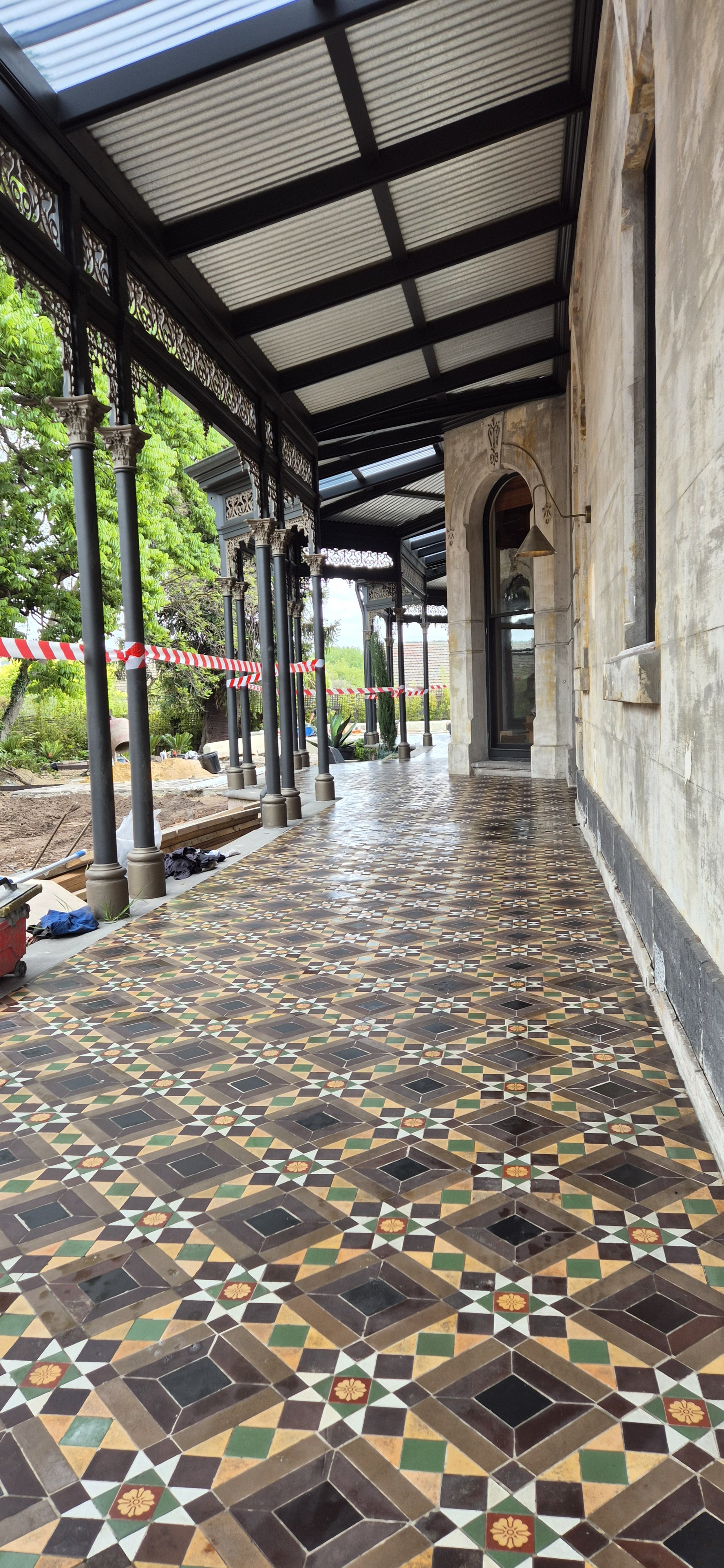
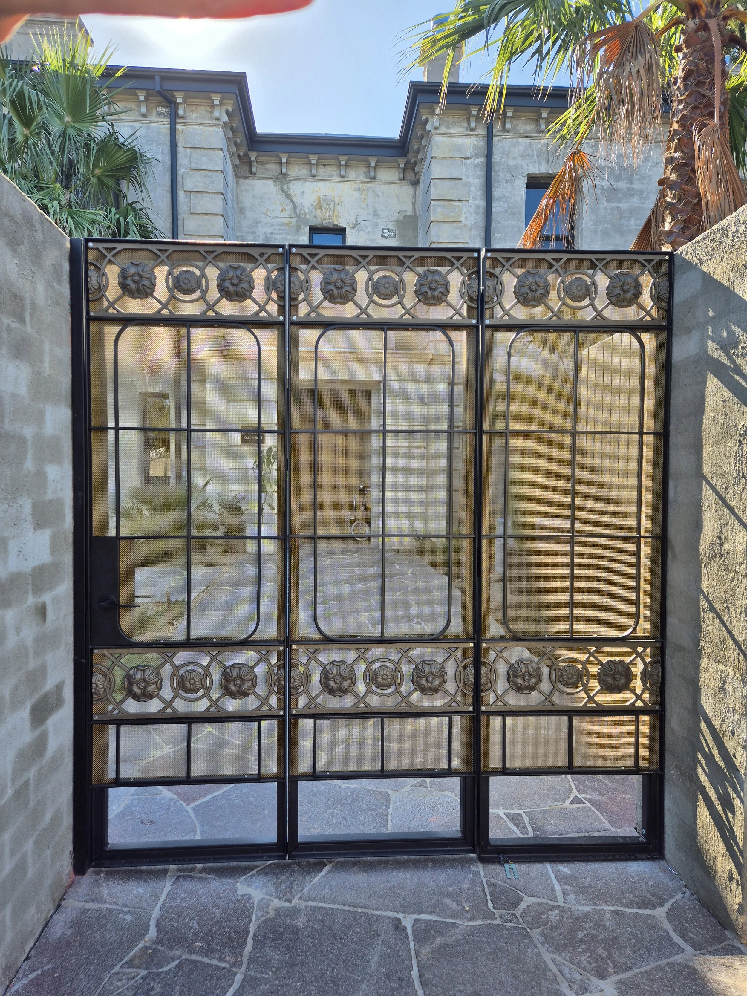
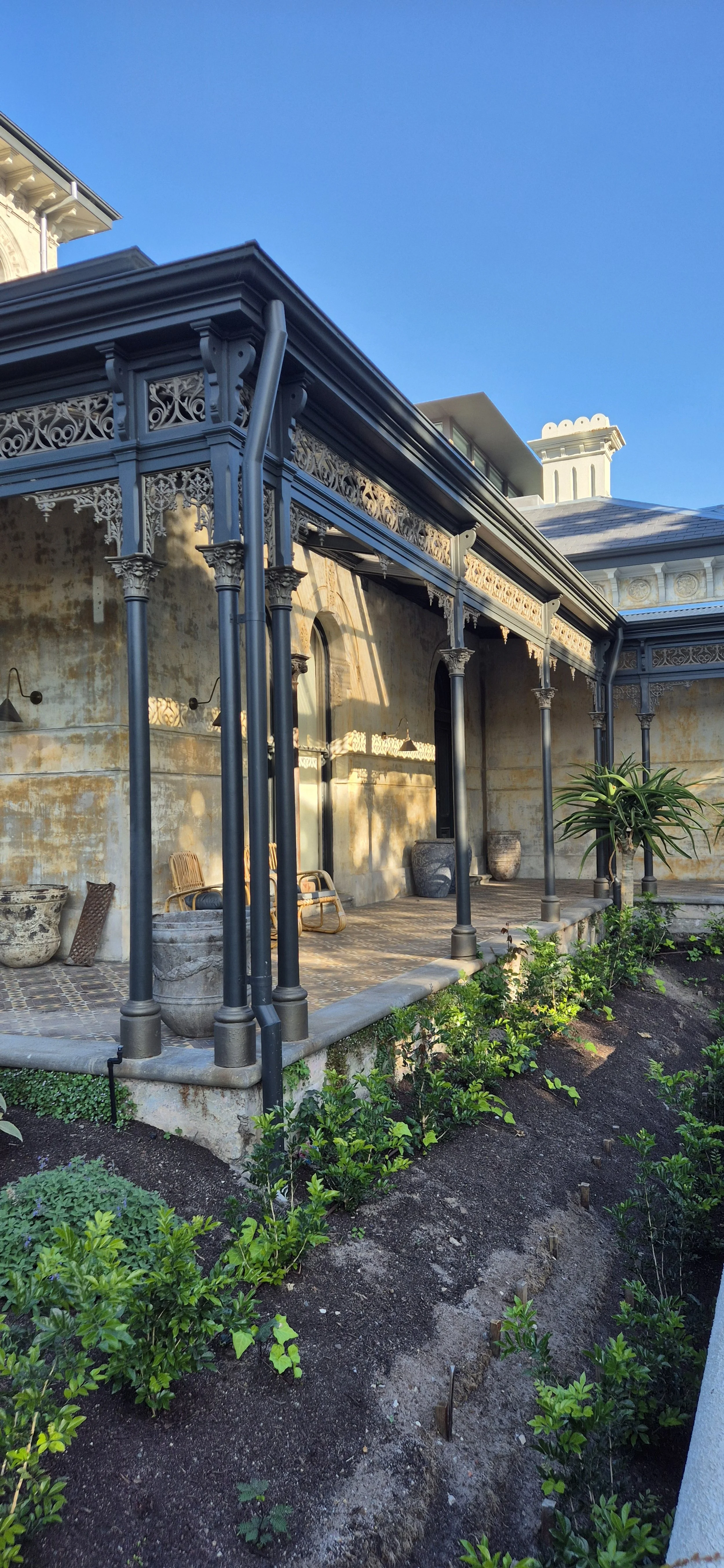
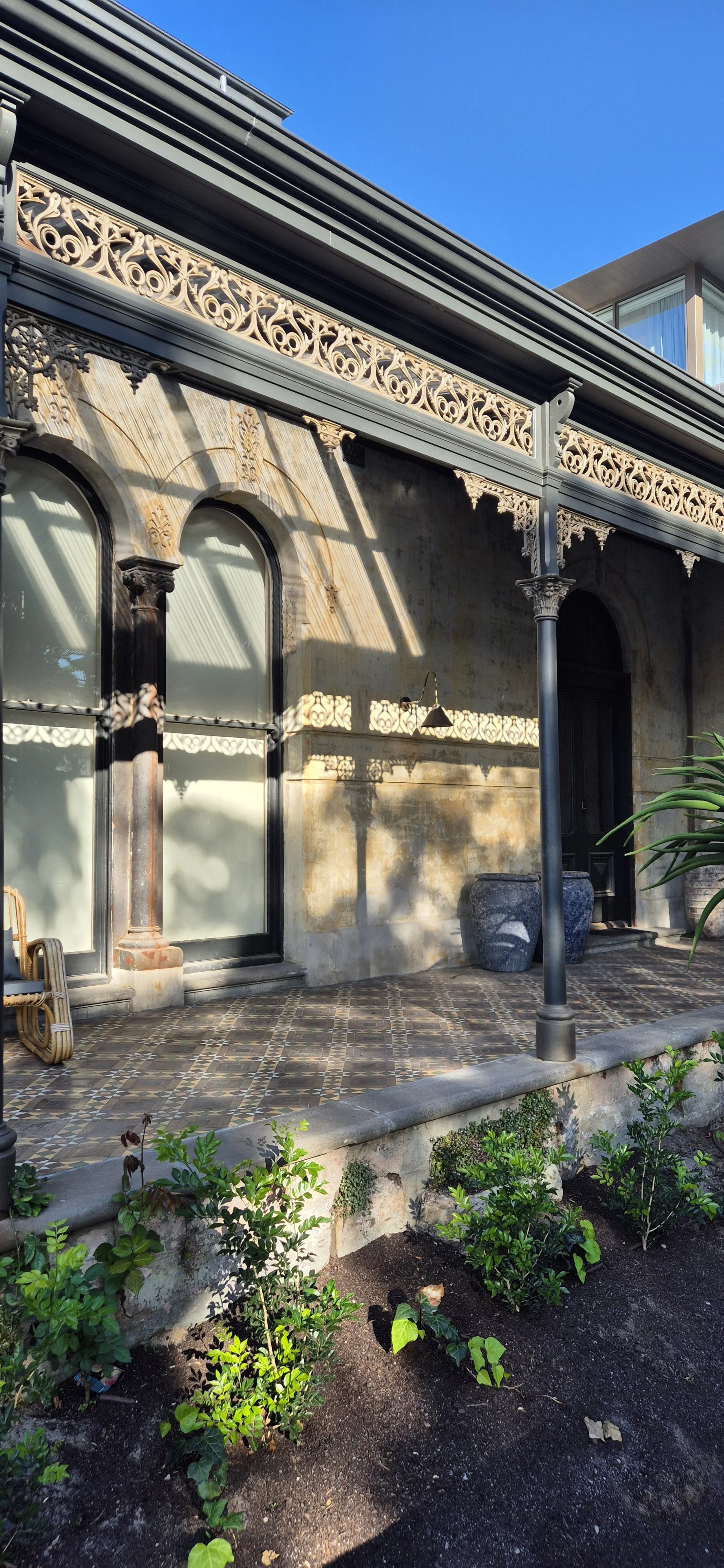
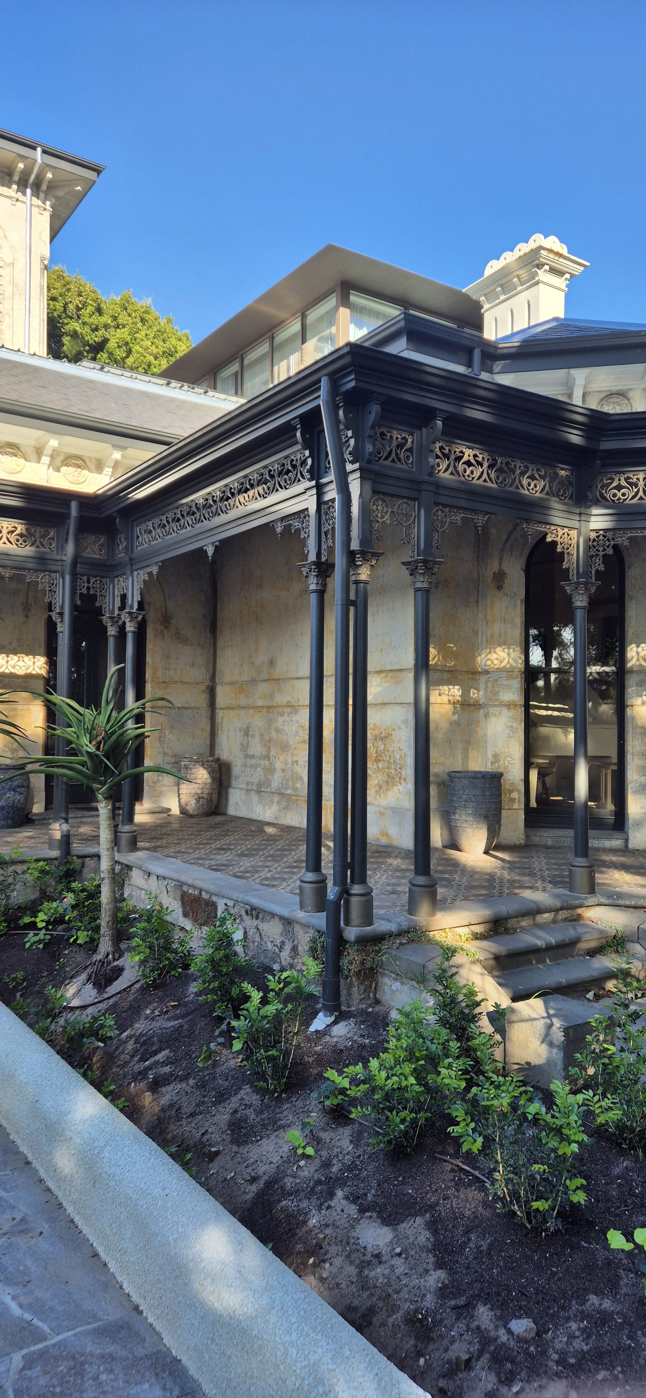
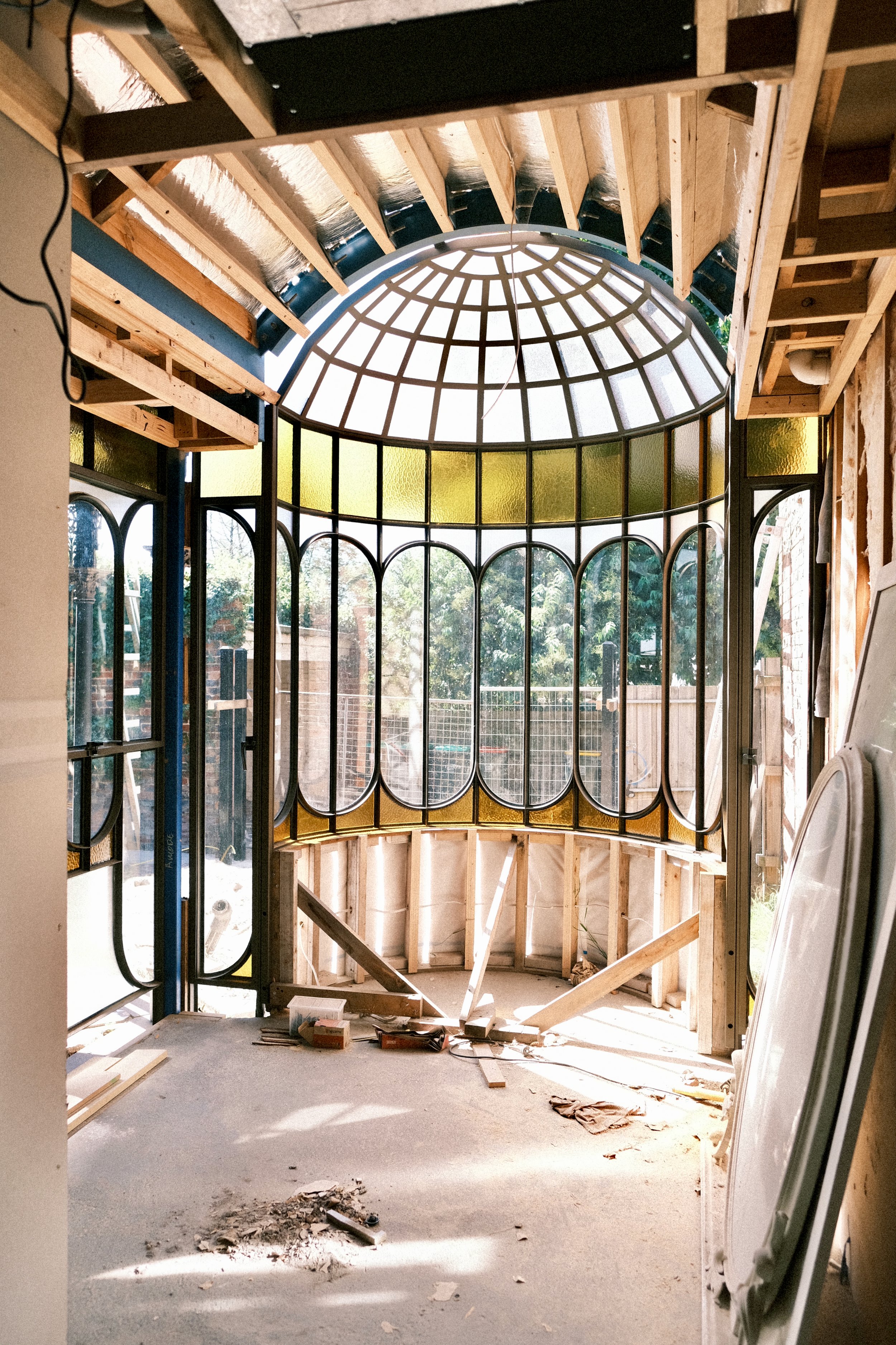
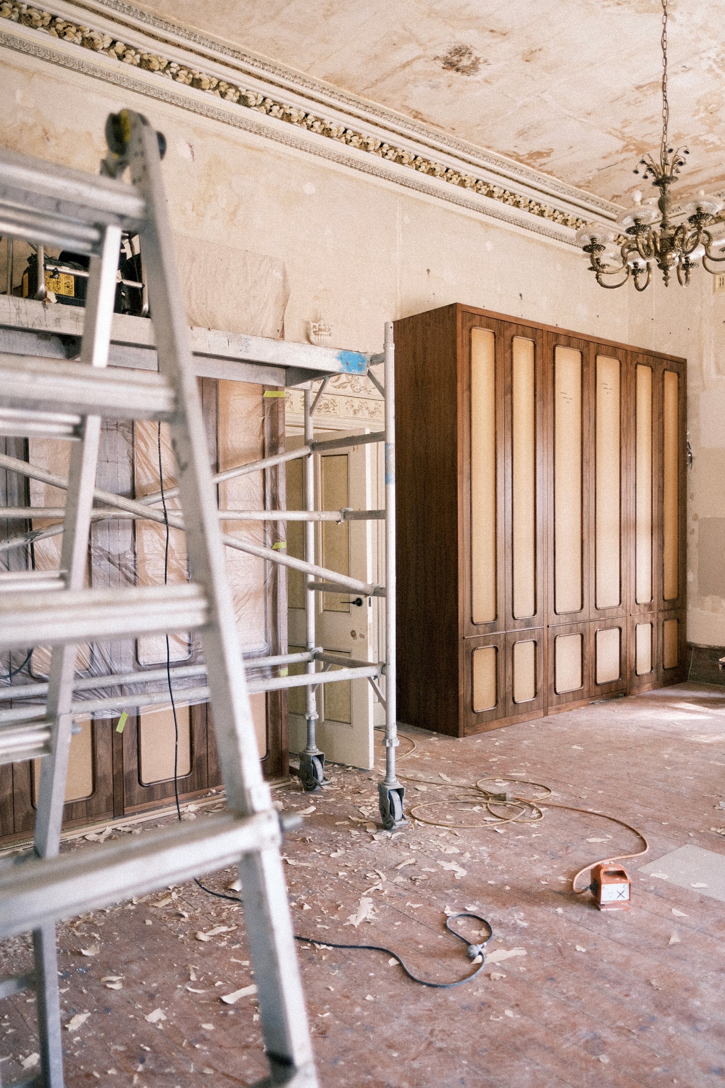
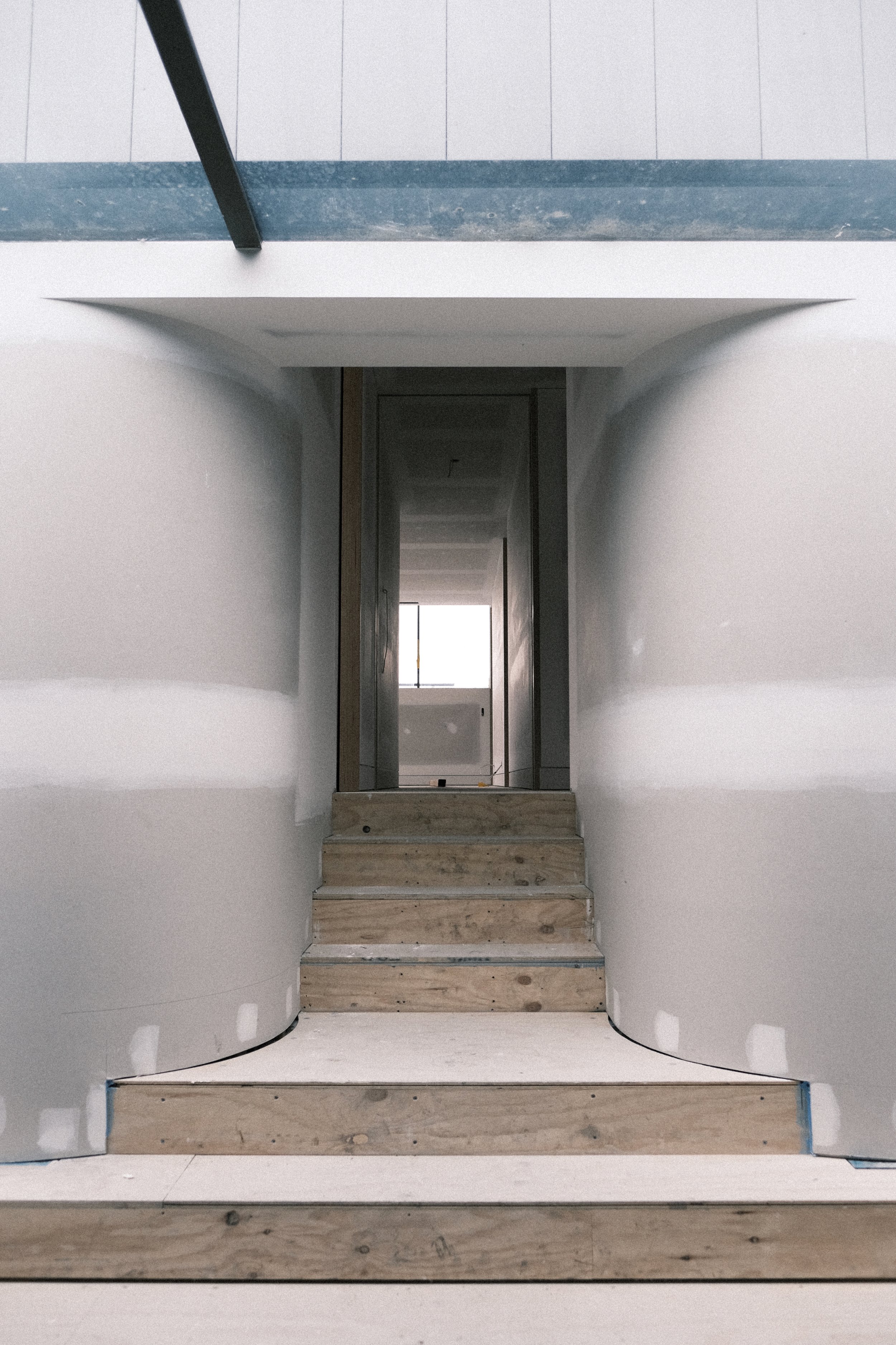
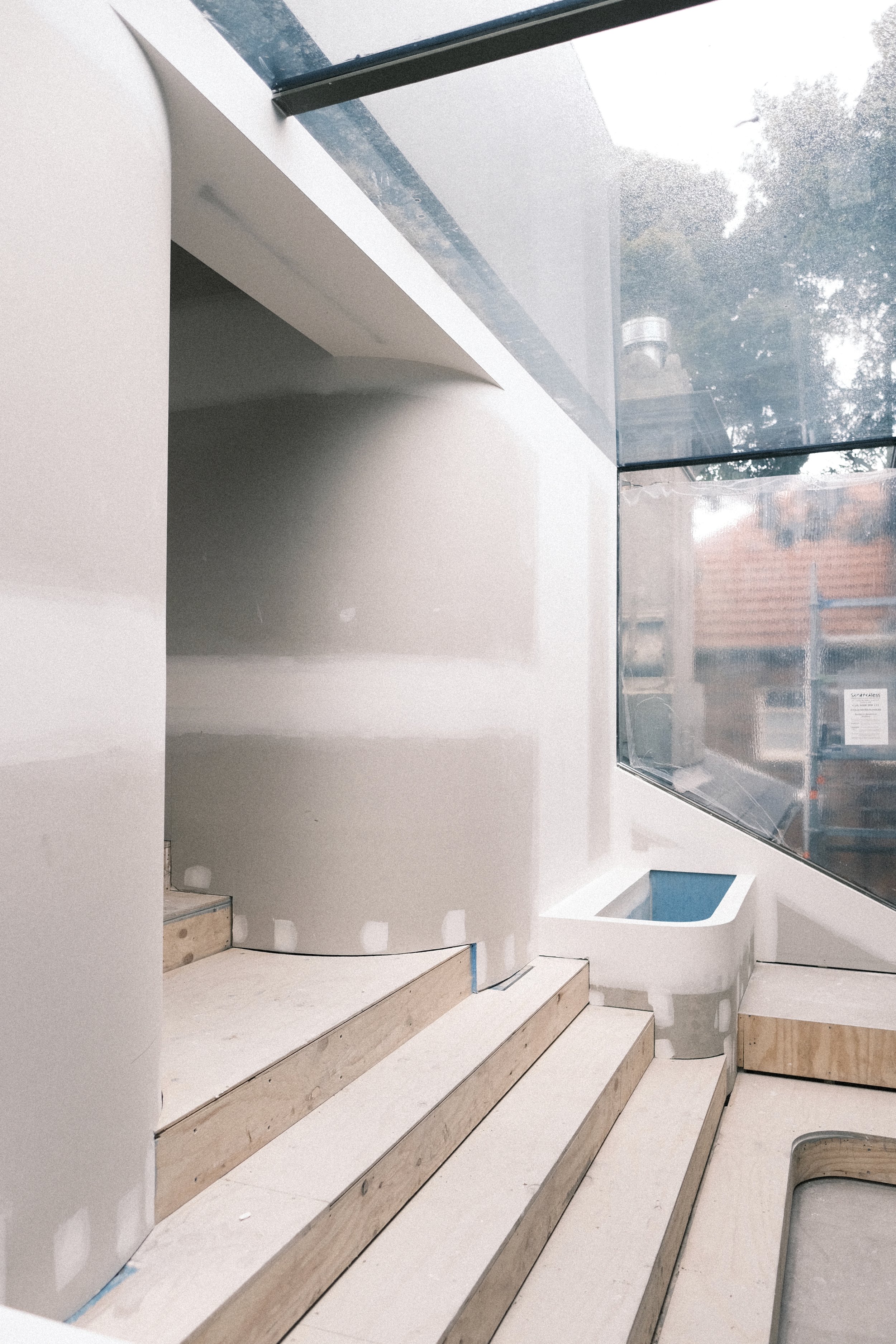
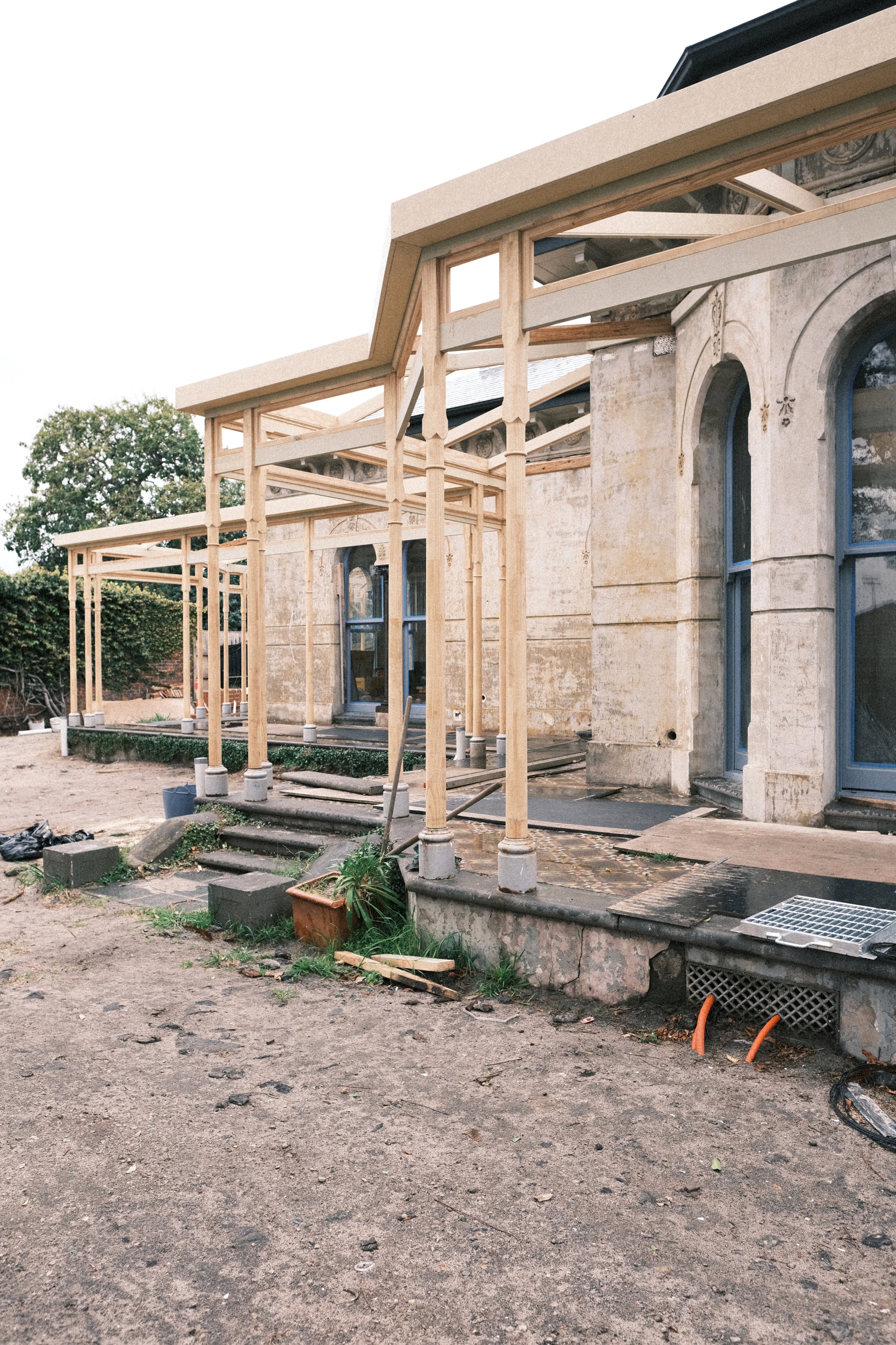
Craigellachie is a c1873 Italianate Victorian residence, built in two stages, classified by the National Trust and largely unchanged since Victorian days. Twenty two rooms. Ornate 15ft ceilings. Intricate tessellated tiles. Baltic pine floors. Eleven marble mantelpieces. Stained glass windows. A two level observation tower. A sprawling return verandah.
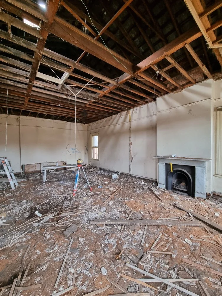
When we first walked through it, the word that kept coming back was romantic. Dilapidated, yes. In need of enormous care and attention. But romantic in the way that only a building with genuine bones and a genuine story can be. The kind of place that asks something of you.
The client understood that immediately. They came not to reinvent it but to honour it. To breathe new life into something that had been quietly waiting. The brief was glamorous and generous. A sophisticated family home with the space and warmth to entertain beautifully, and enough room that the children would never want to leave.
What made this project truly special was the team that came together around it. Flack Studio, Connect Plus, Florian Wild and Basis Builders worked tirelessly with the care and craft a building like this demands. Collaboration in the truest sense of the word, every discipline present, every voice genuinely in play.
This is what heritage work is really about. Not preservation for its own sake, but the belief that a building's story is worth continuing. That the right family, the right vision, and the right team can return something extraordinary to its former glory without dimming a single thing that made it special.
Craigellachie is magnificent. It always was.
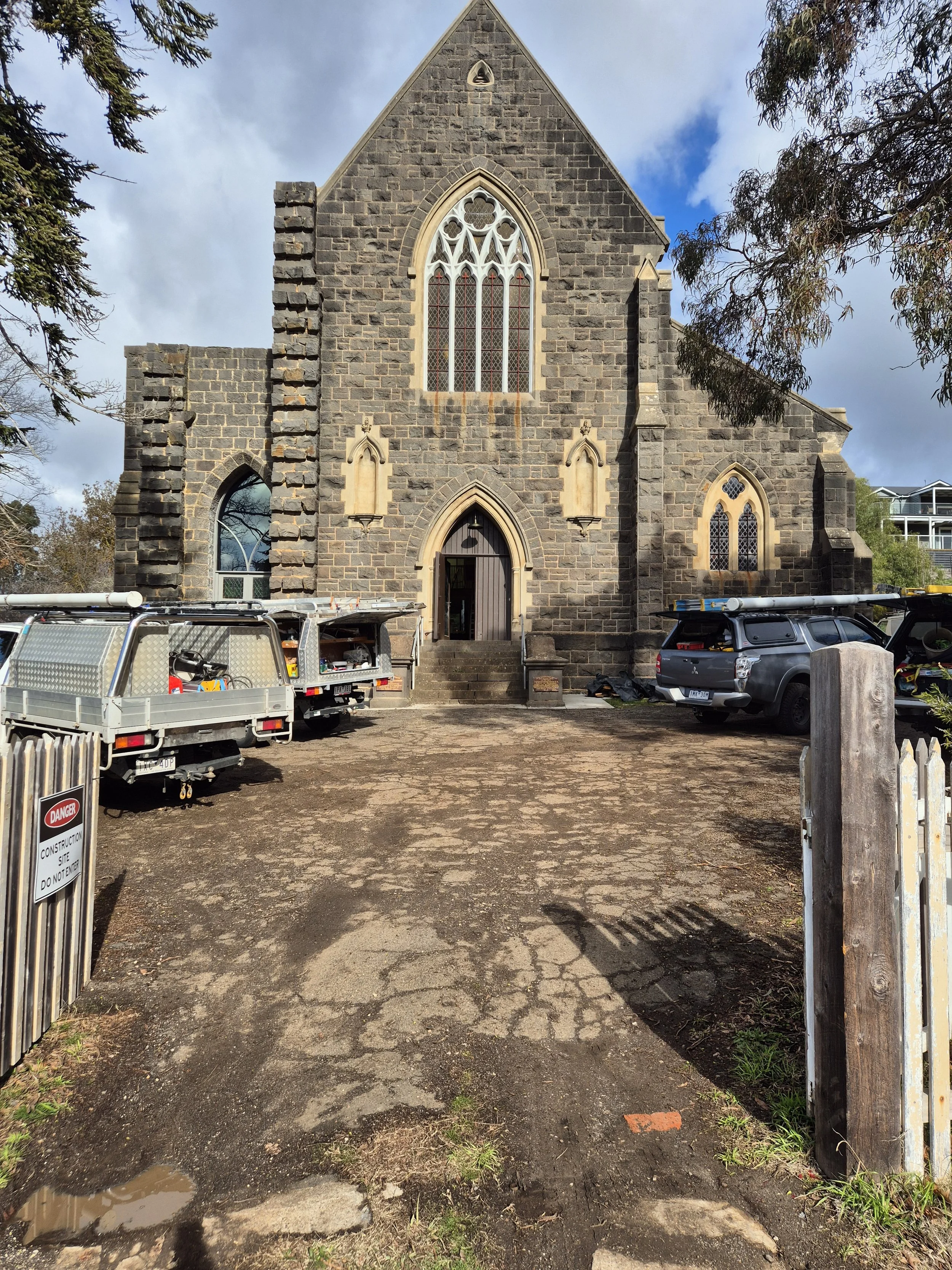
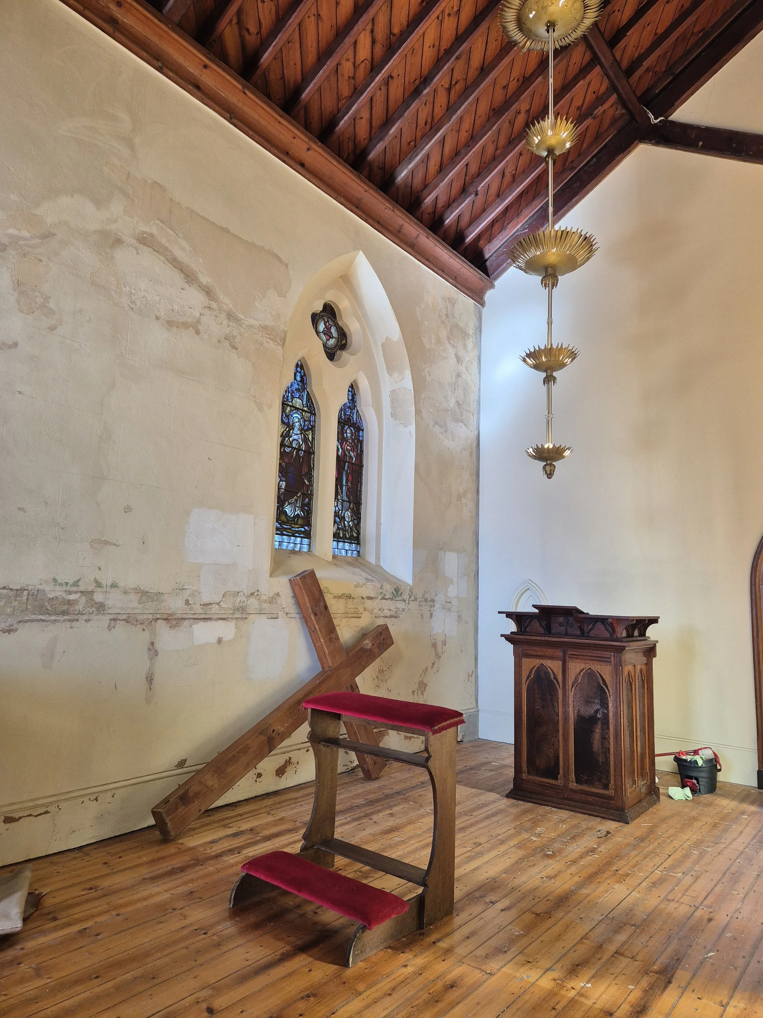
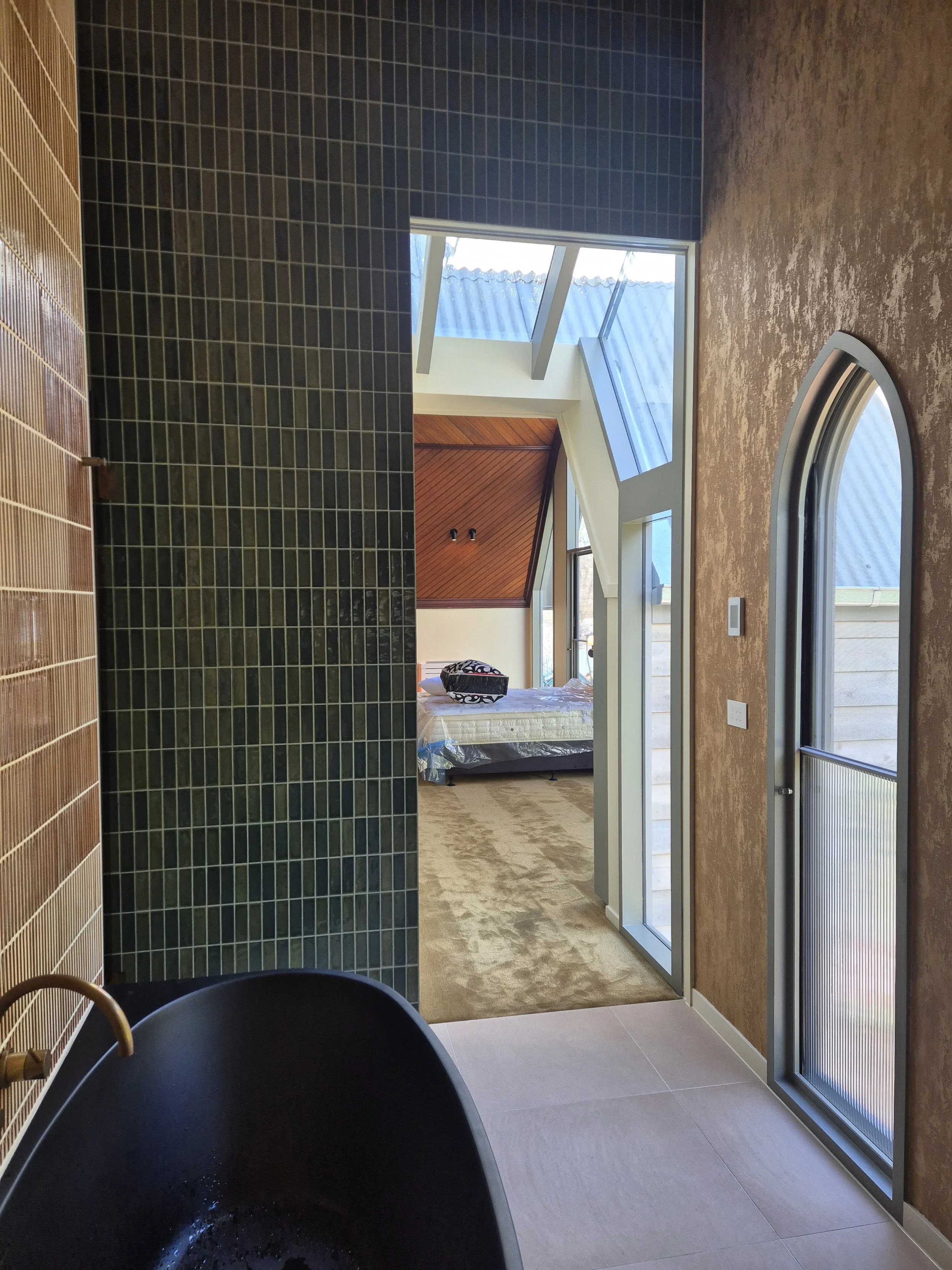
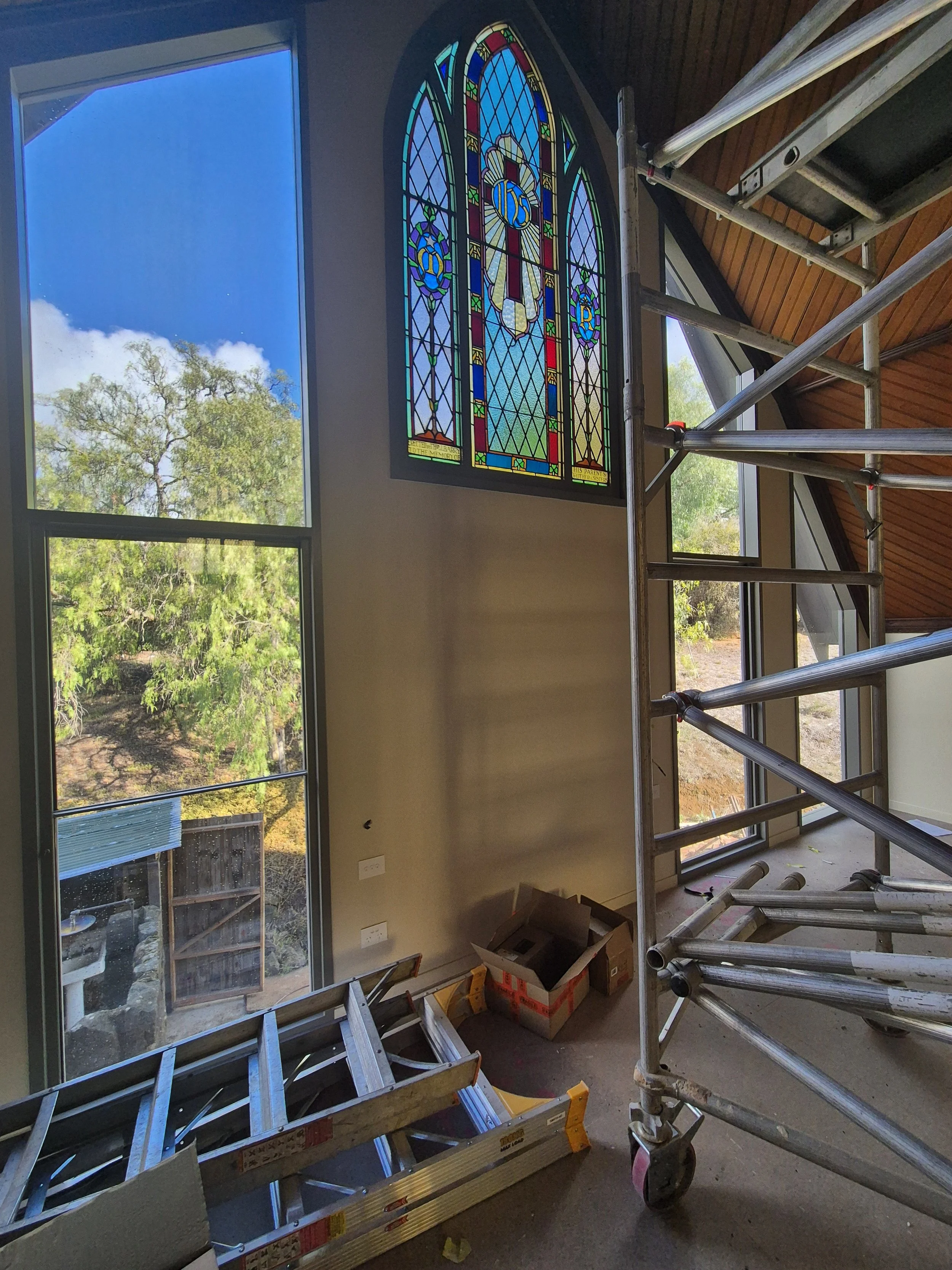
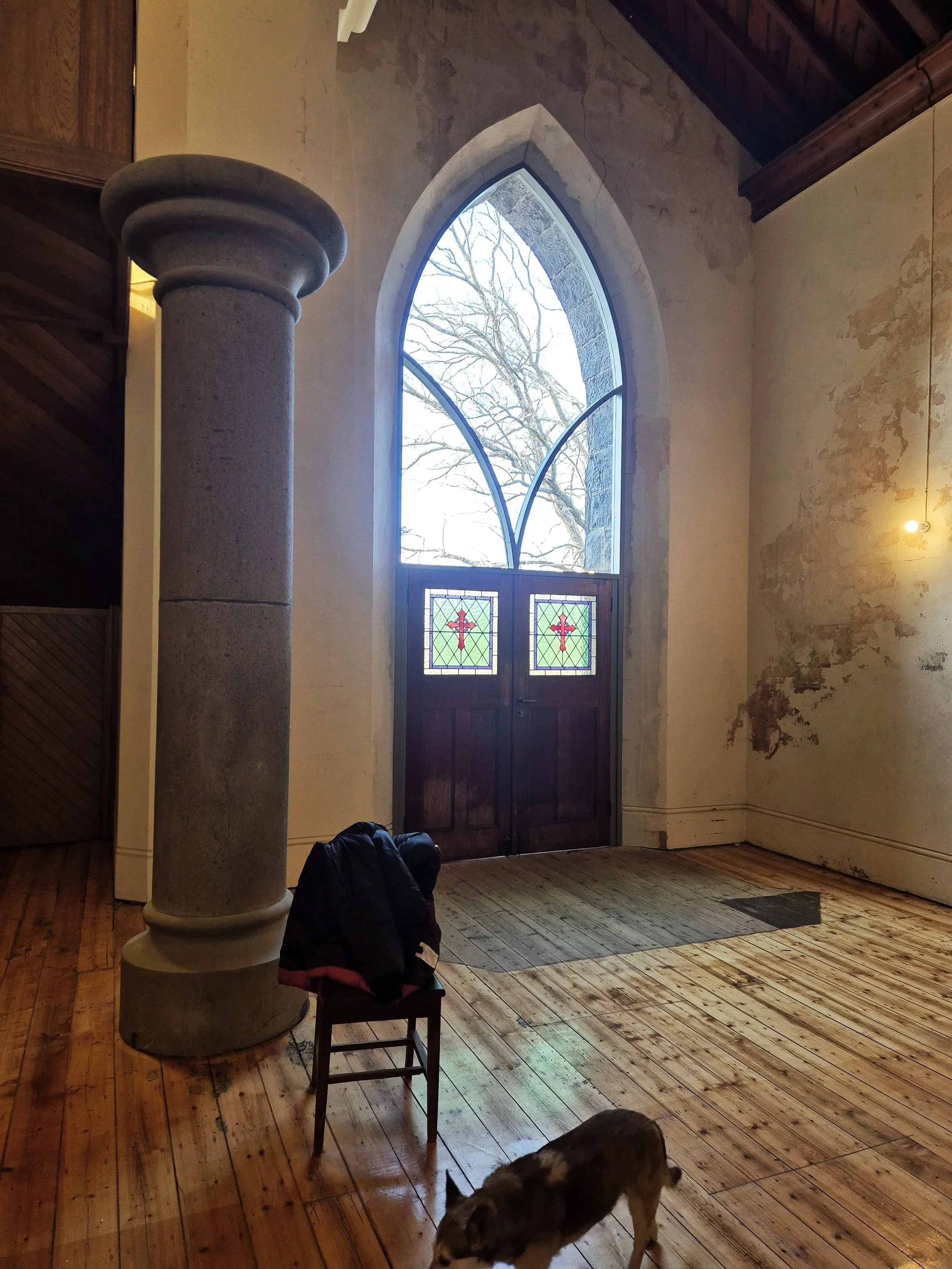
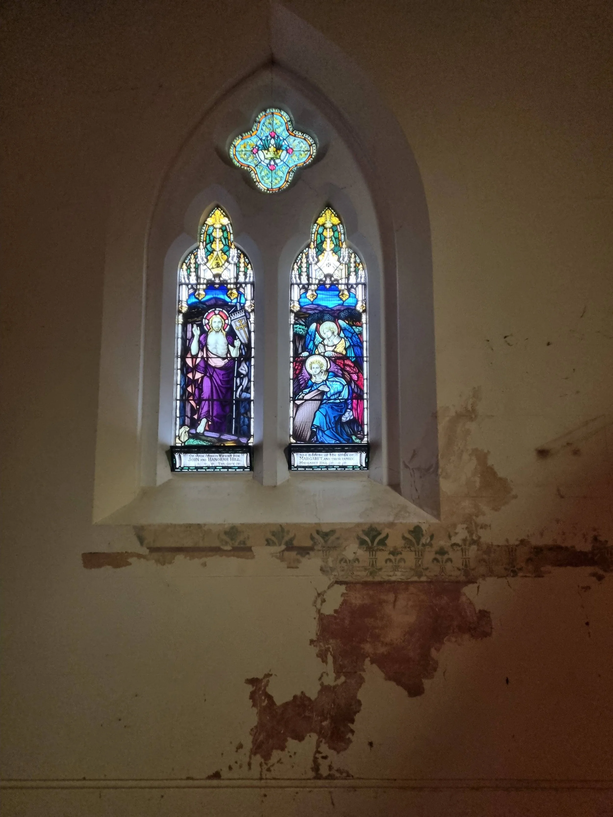
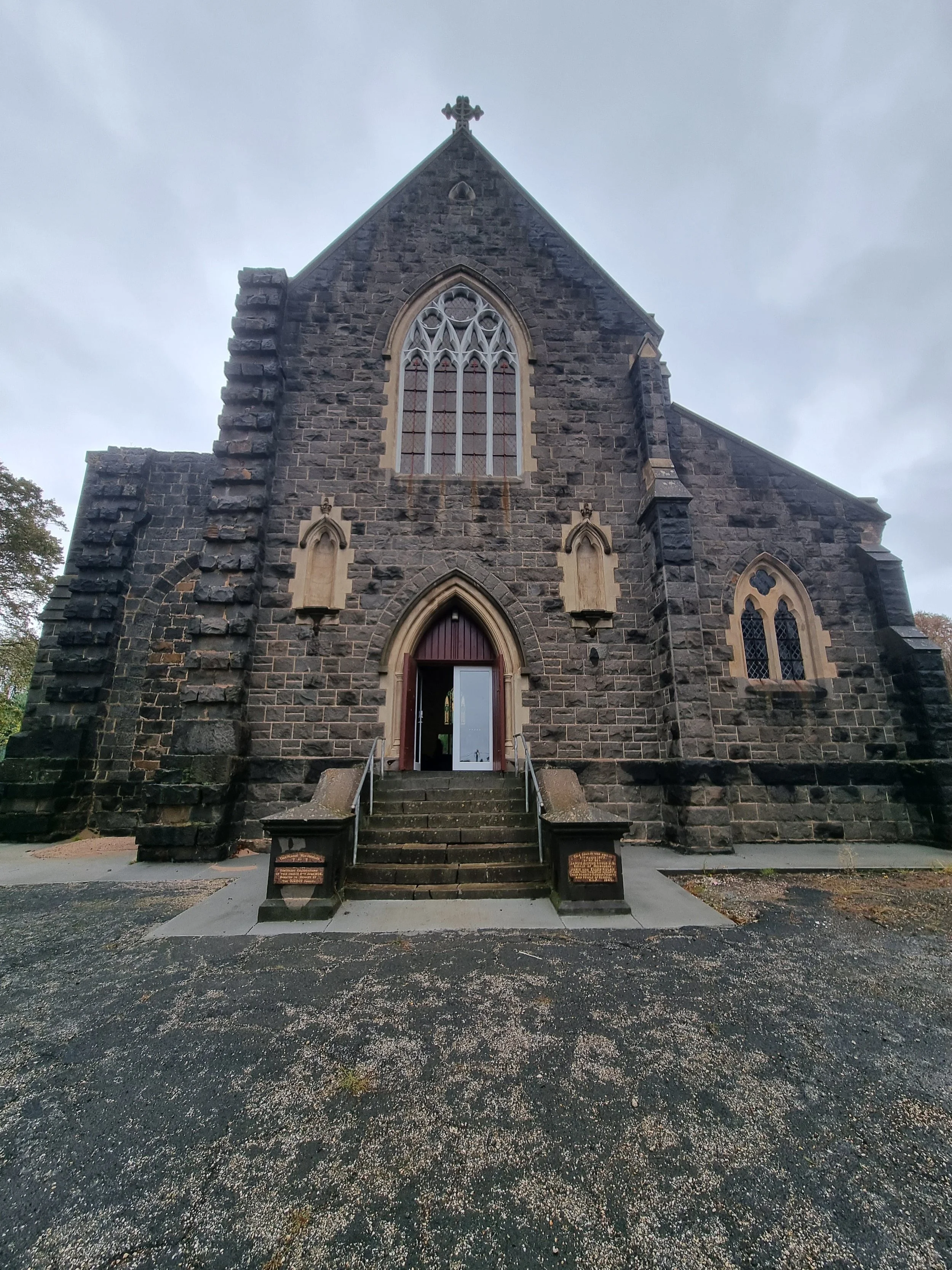
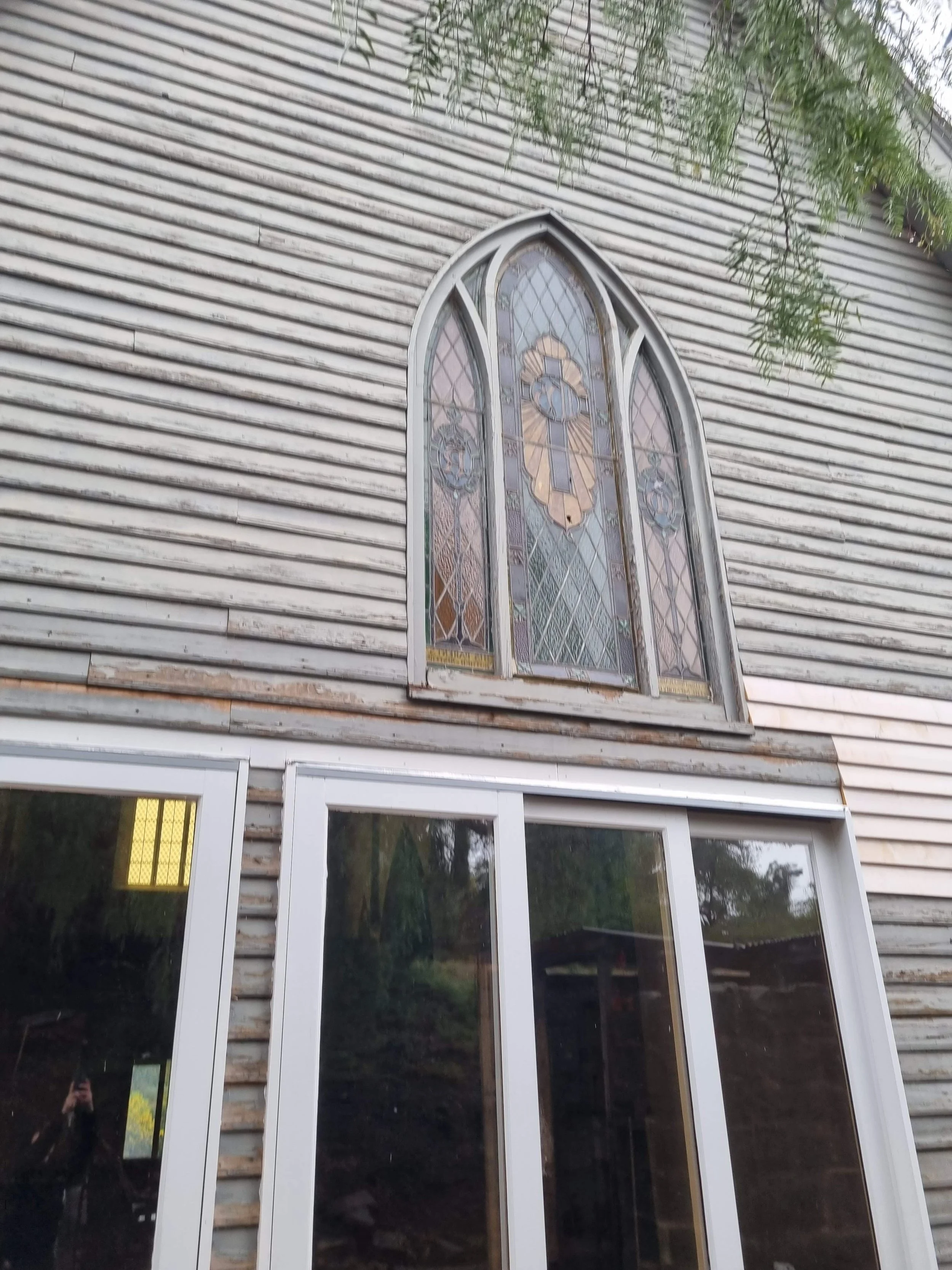
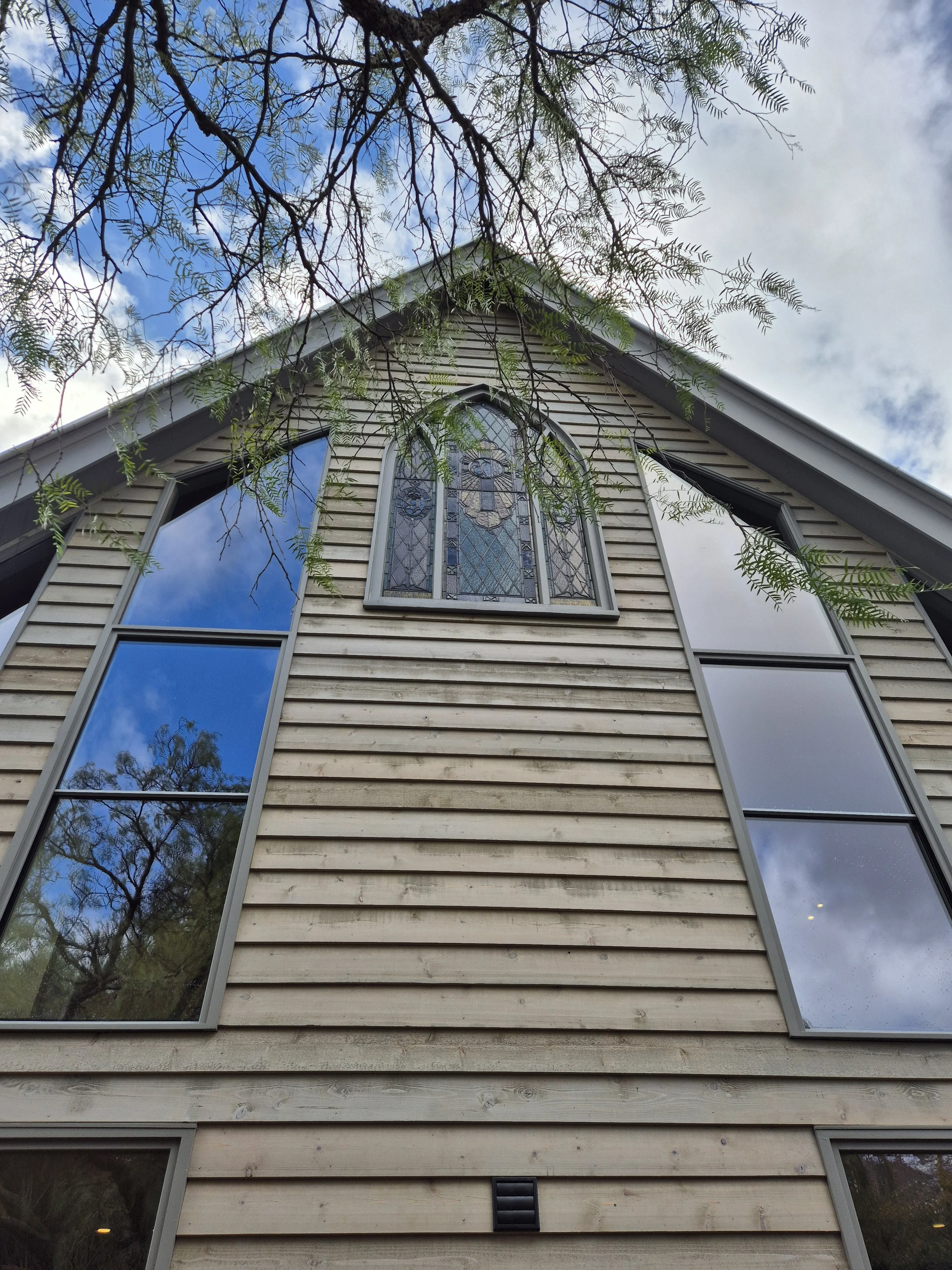
St Thomas Aquinas Church, Clunes Built in bluestone in 1872, St Thomas Aquinas has stood at the heart of Clunes for over 150 years.
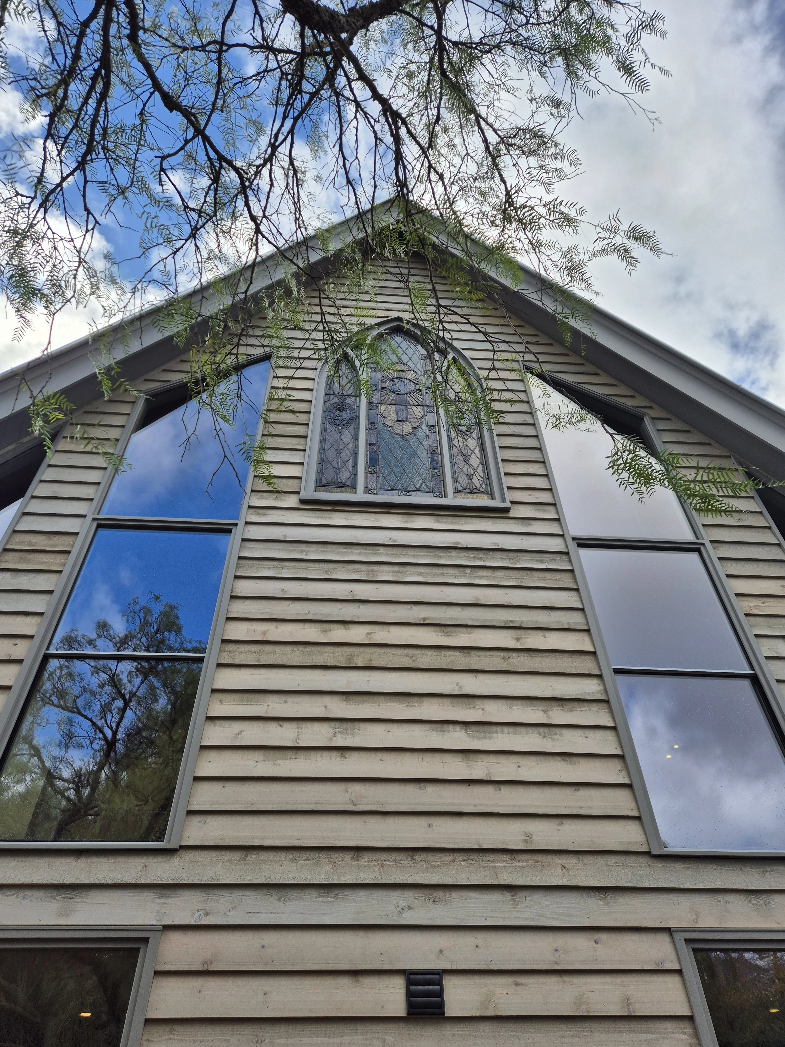
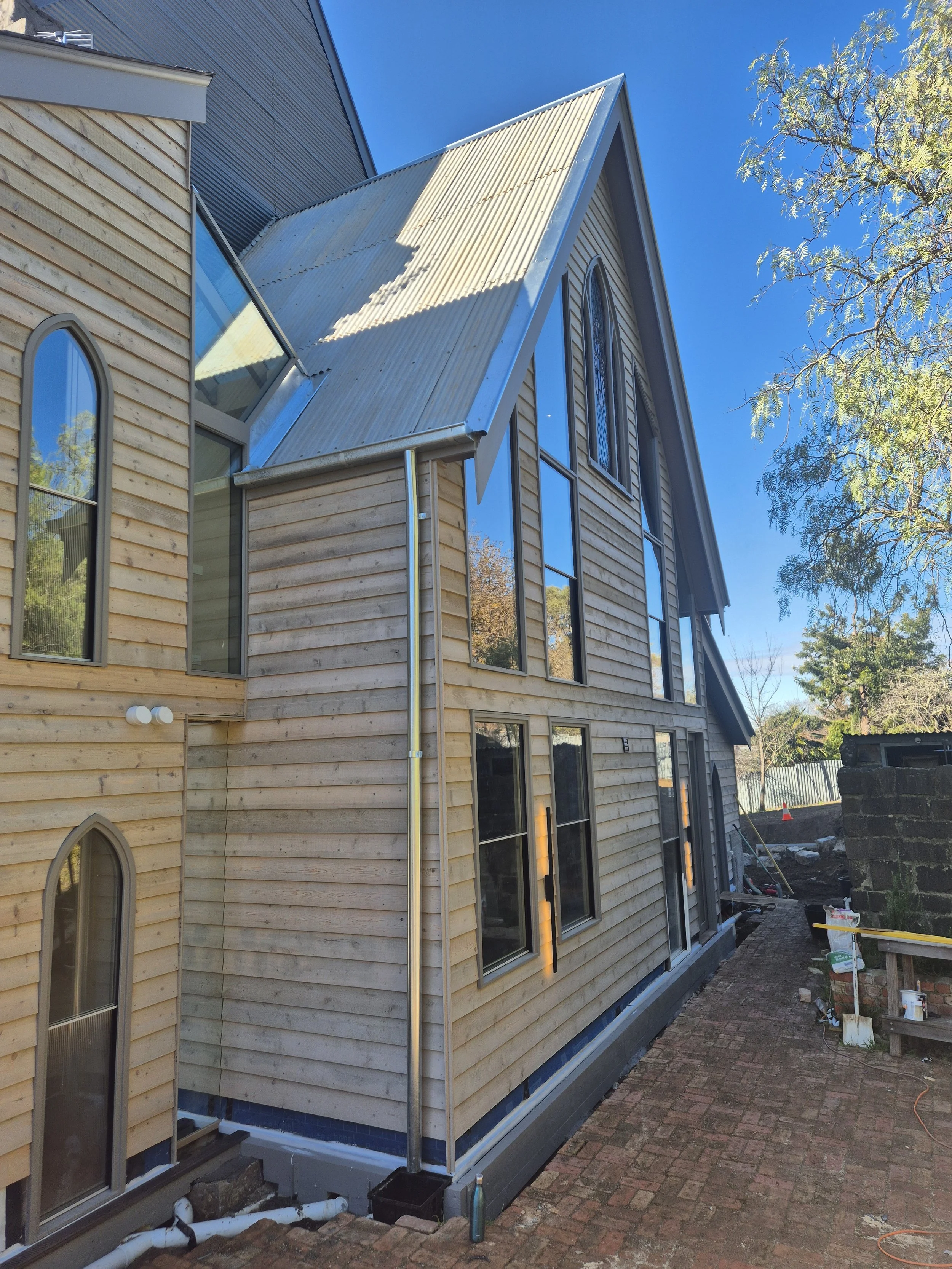
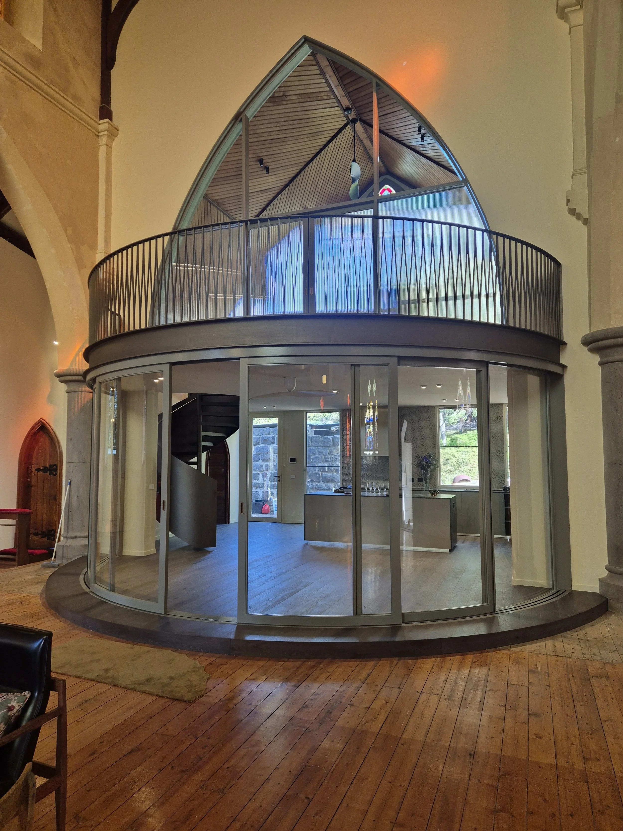
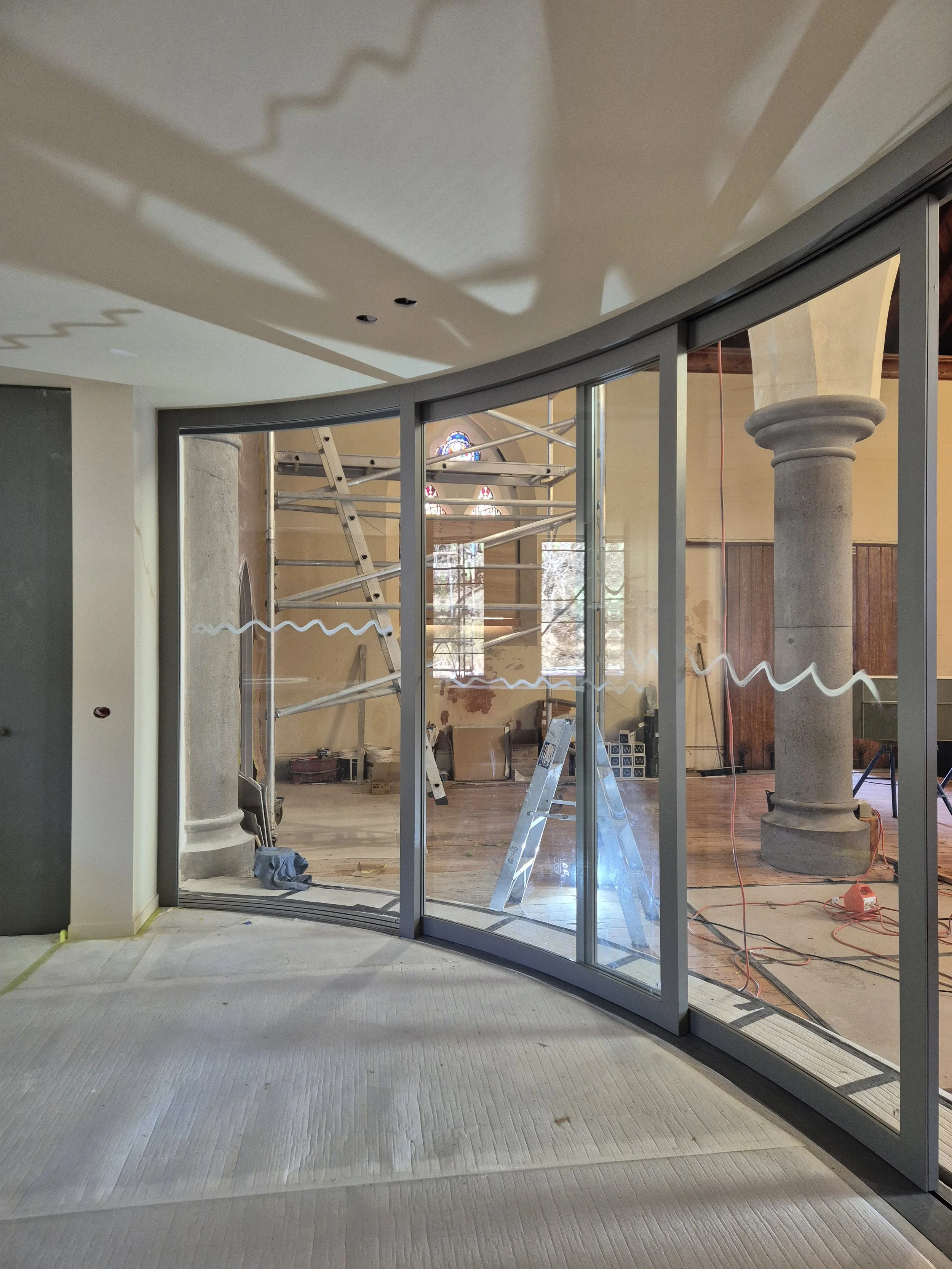
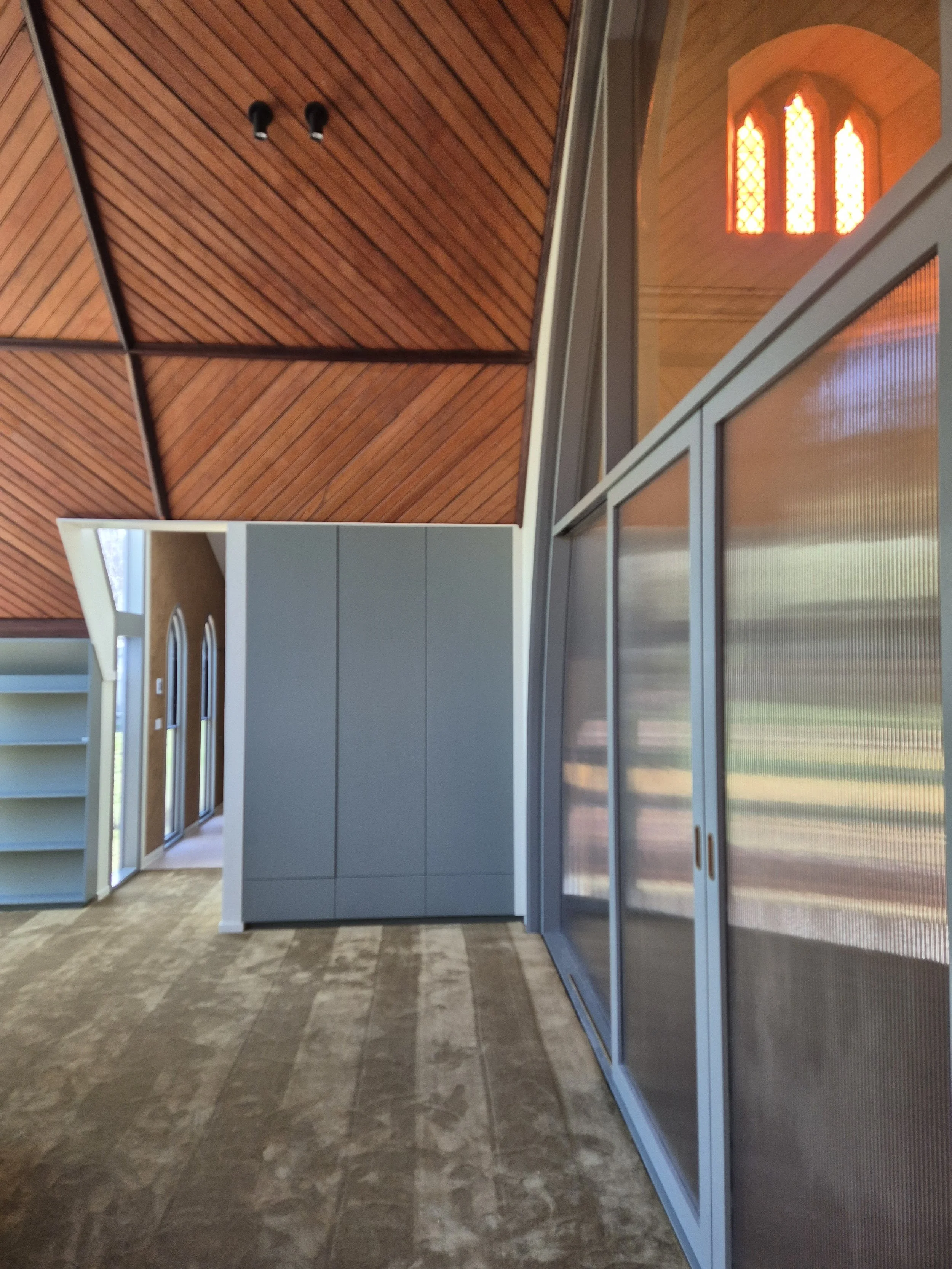
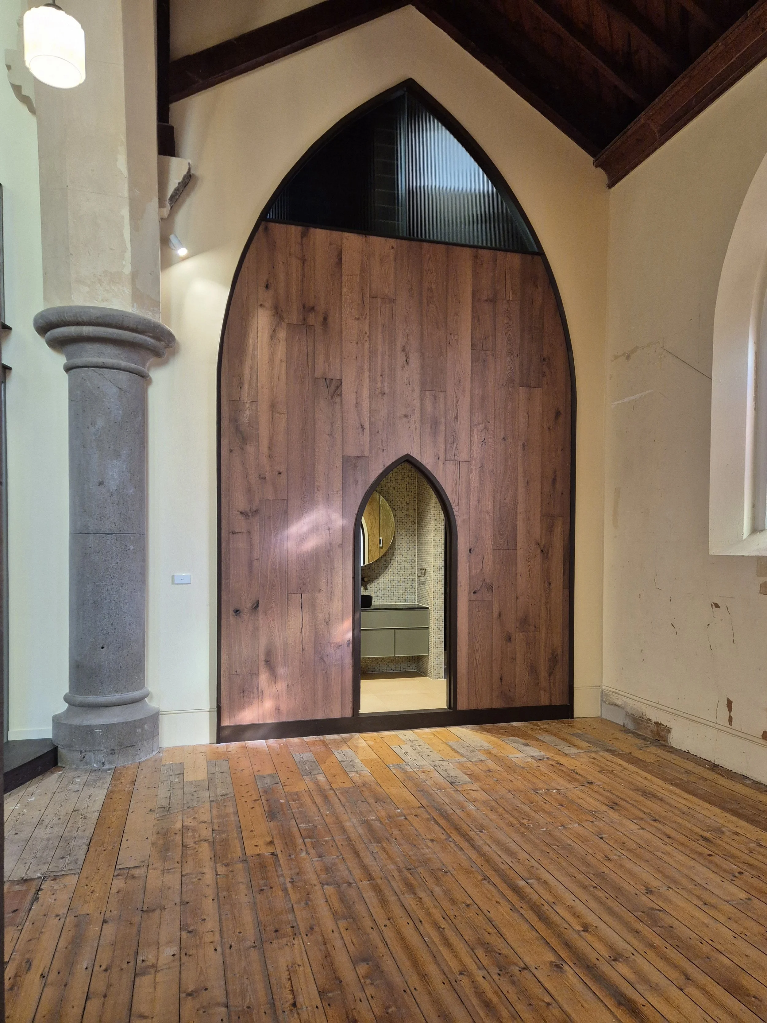
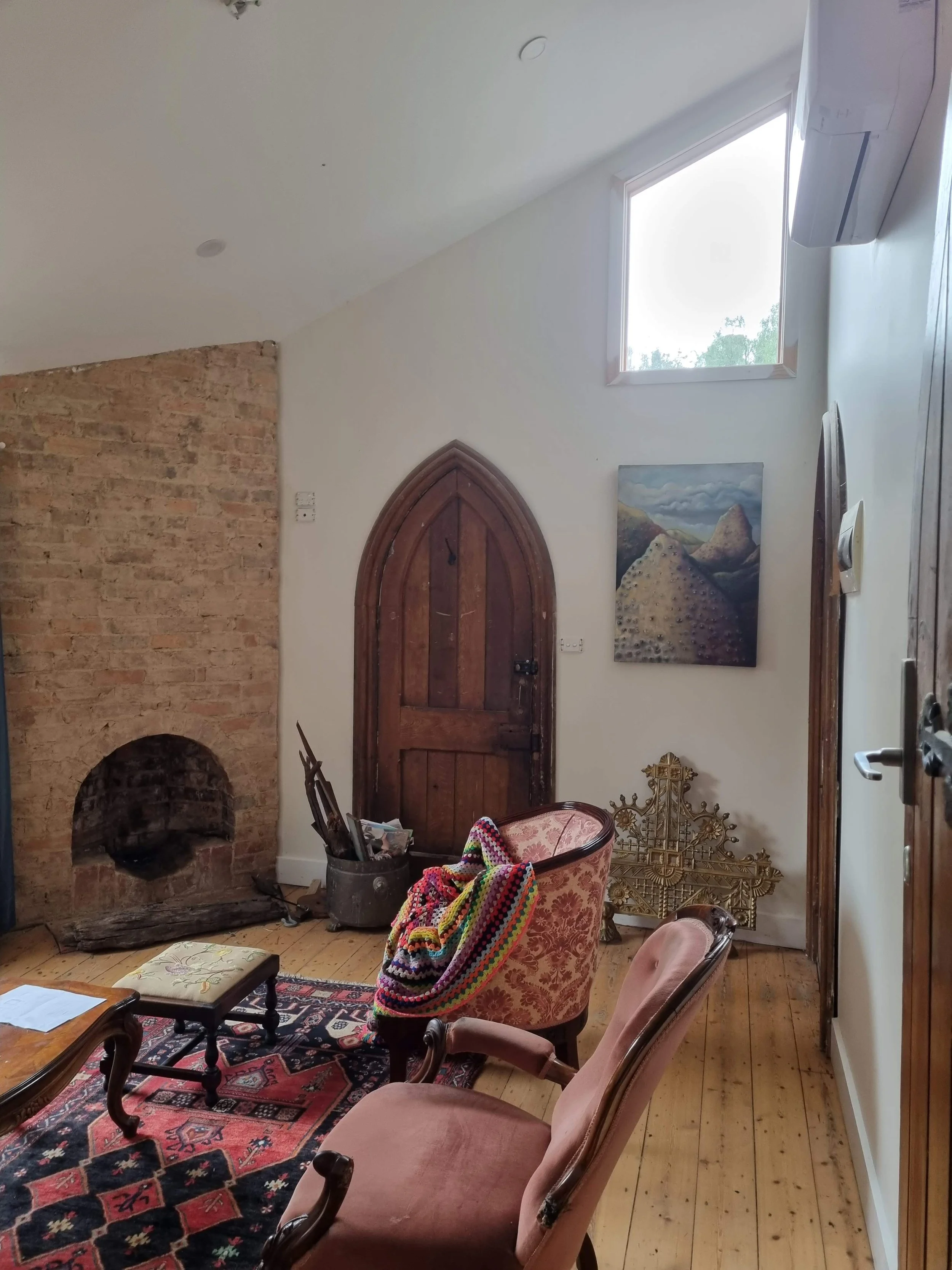
The brief was to convert the church into a private residence without diminishing what made it worth saving. The church volume is retained intact. Soaring curved glass doors enclose the space while managing heat, bringing the nave into the present without surrendering its scale.
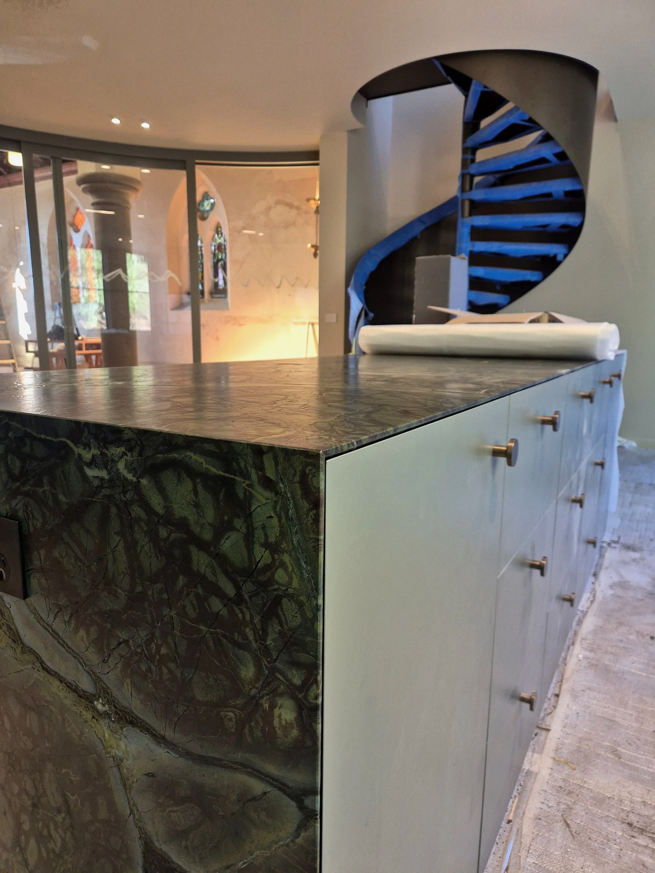
A semicircular platform stage defines the dining area, elevated and set apart, with the kitchen beyond. The gesture echoes the original chancel without referencing it literally. It just feels right.
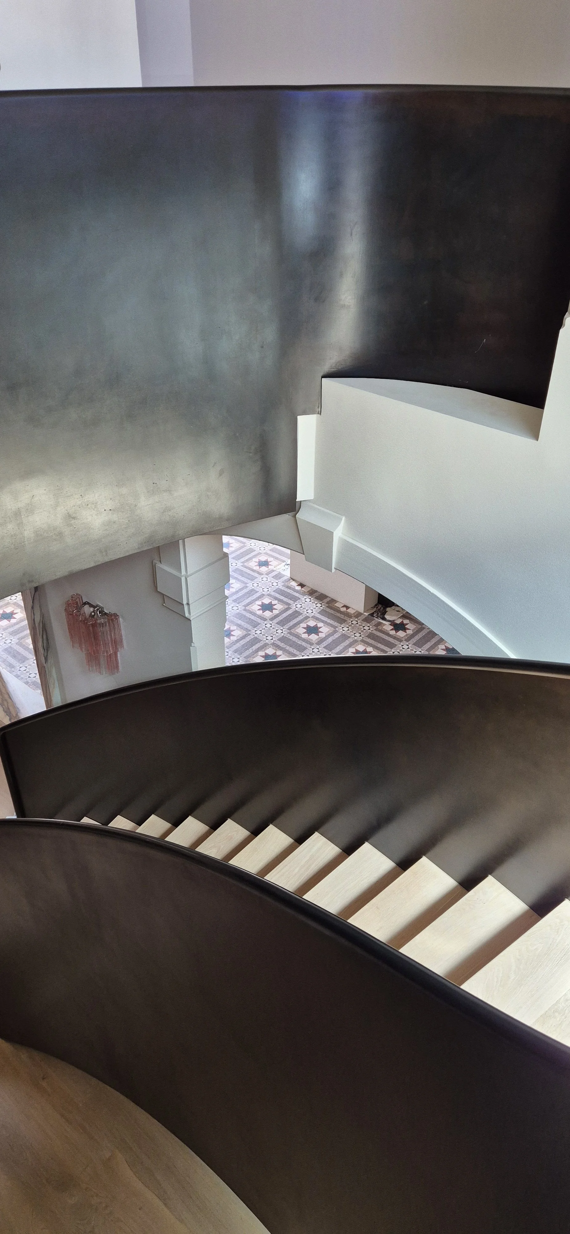
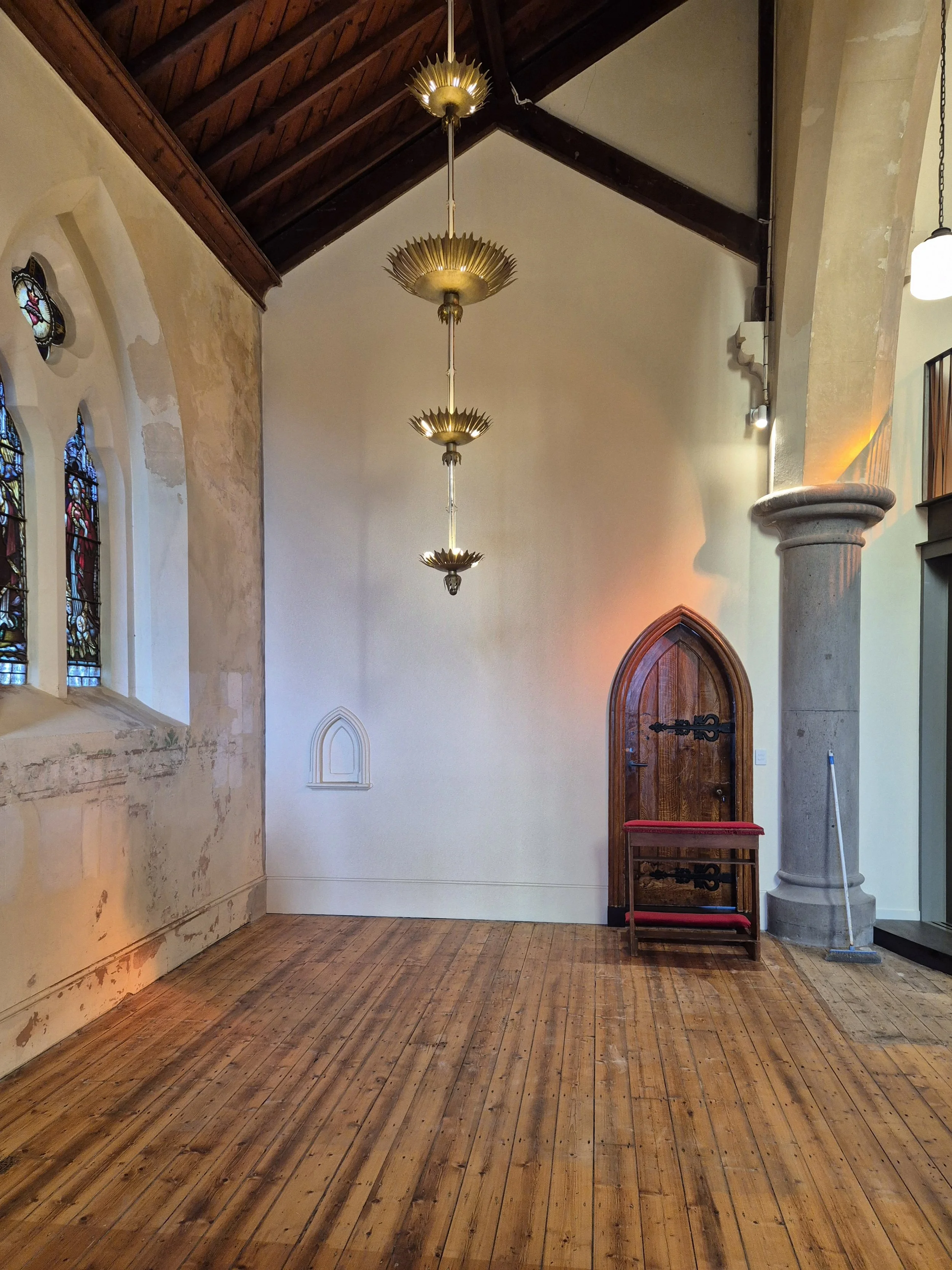
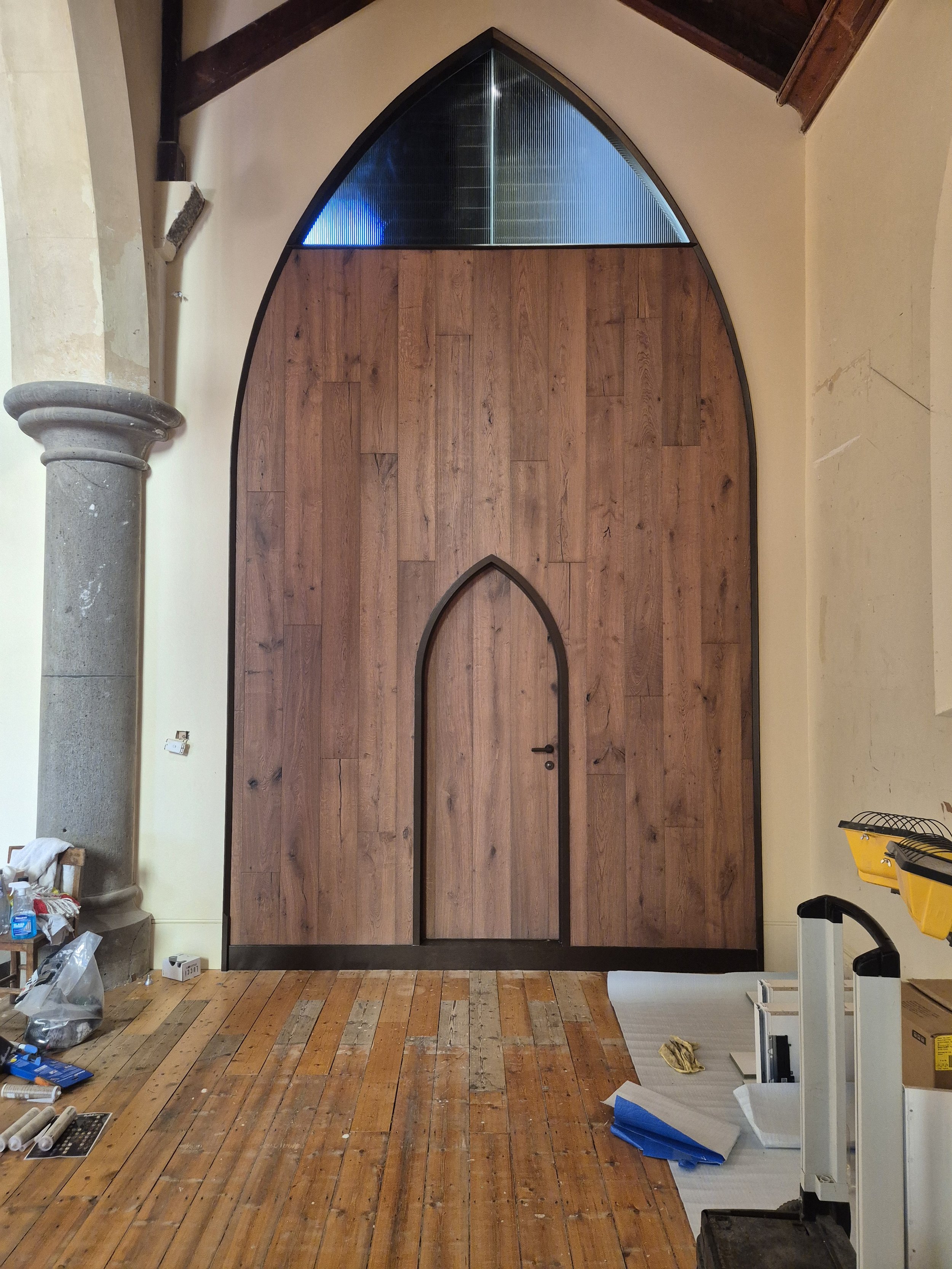
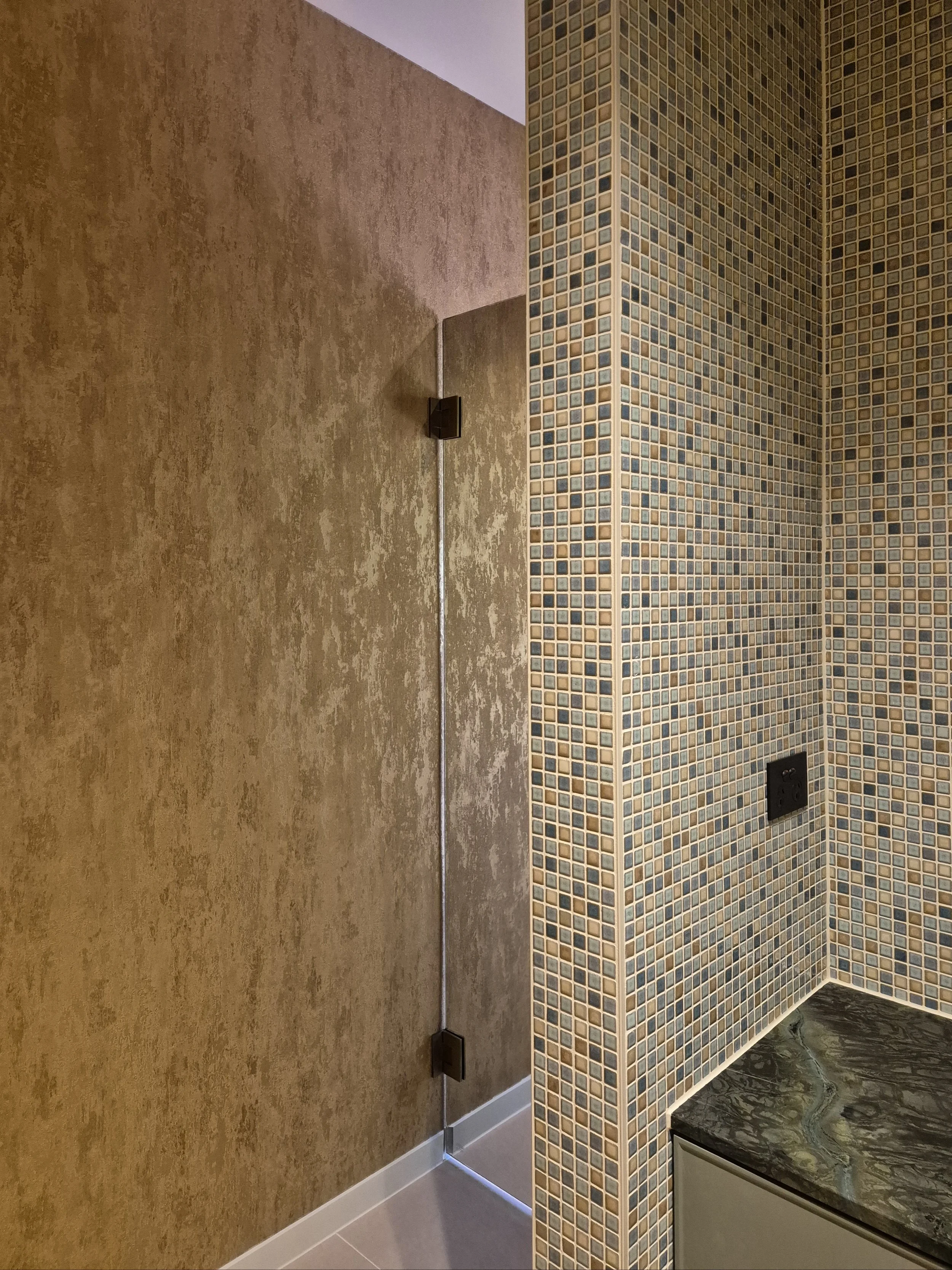
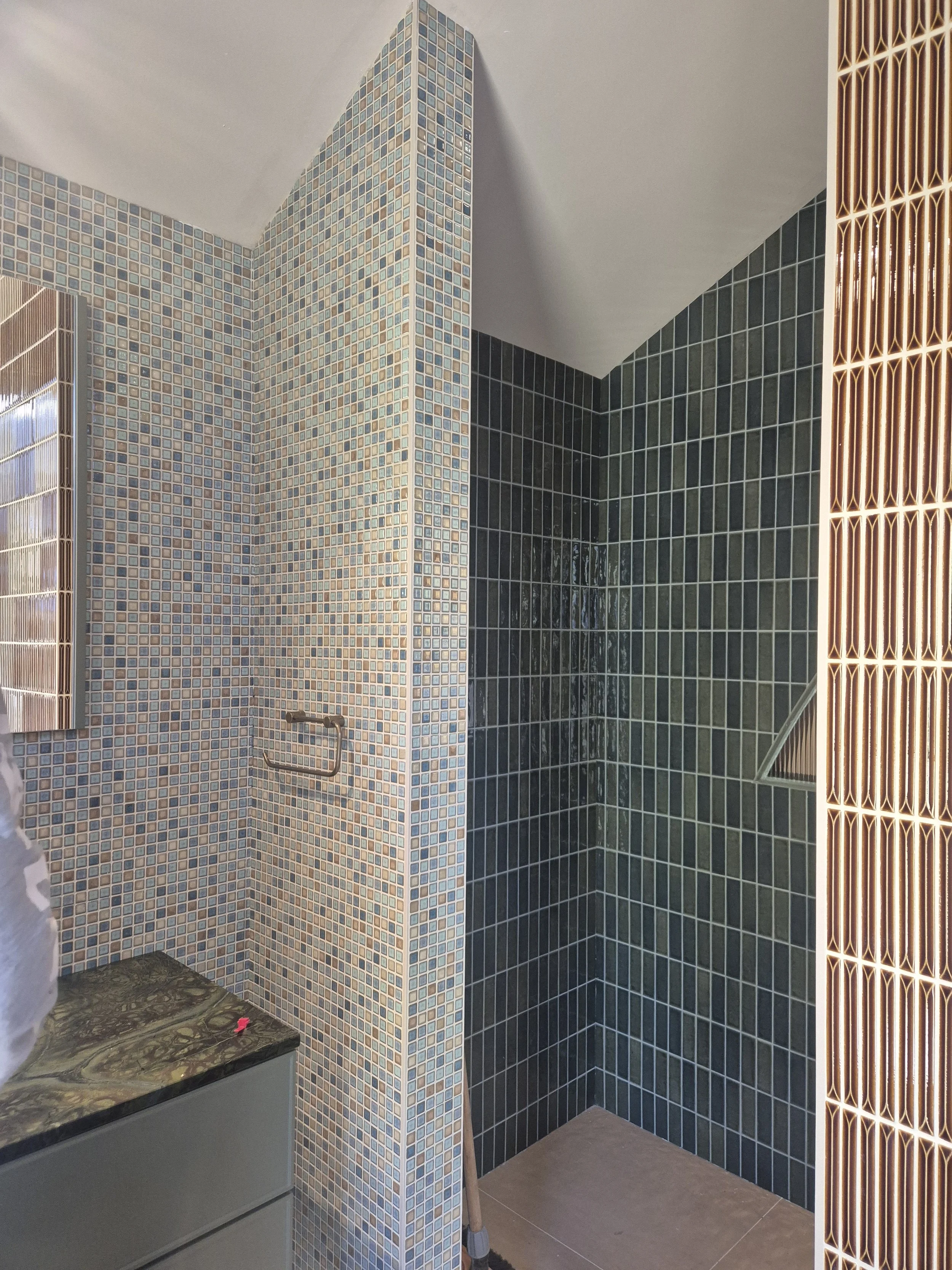
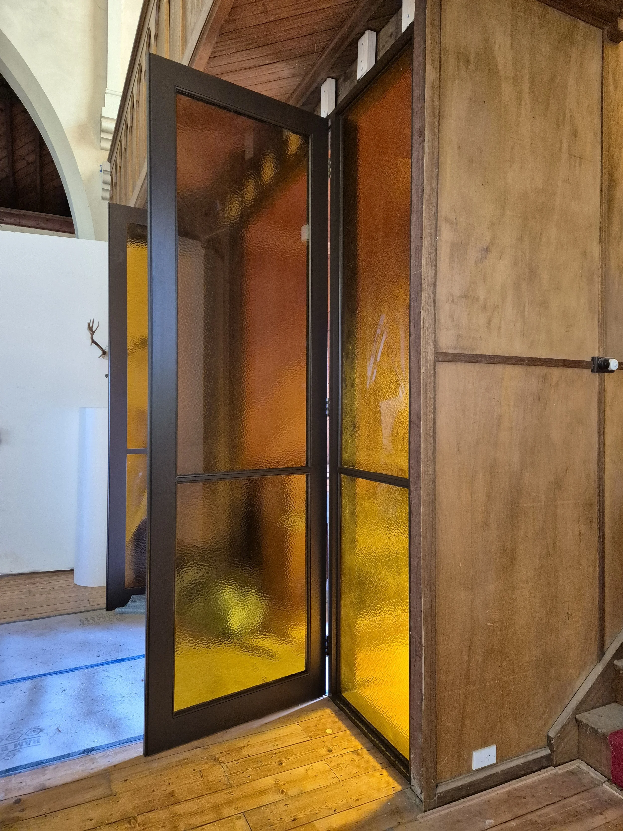
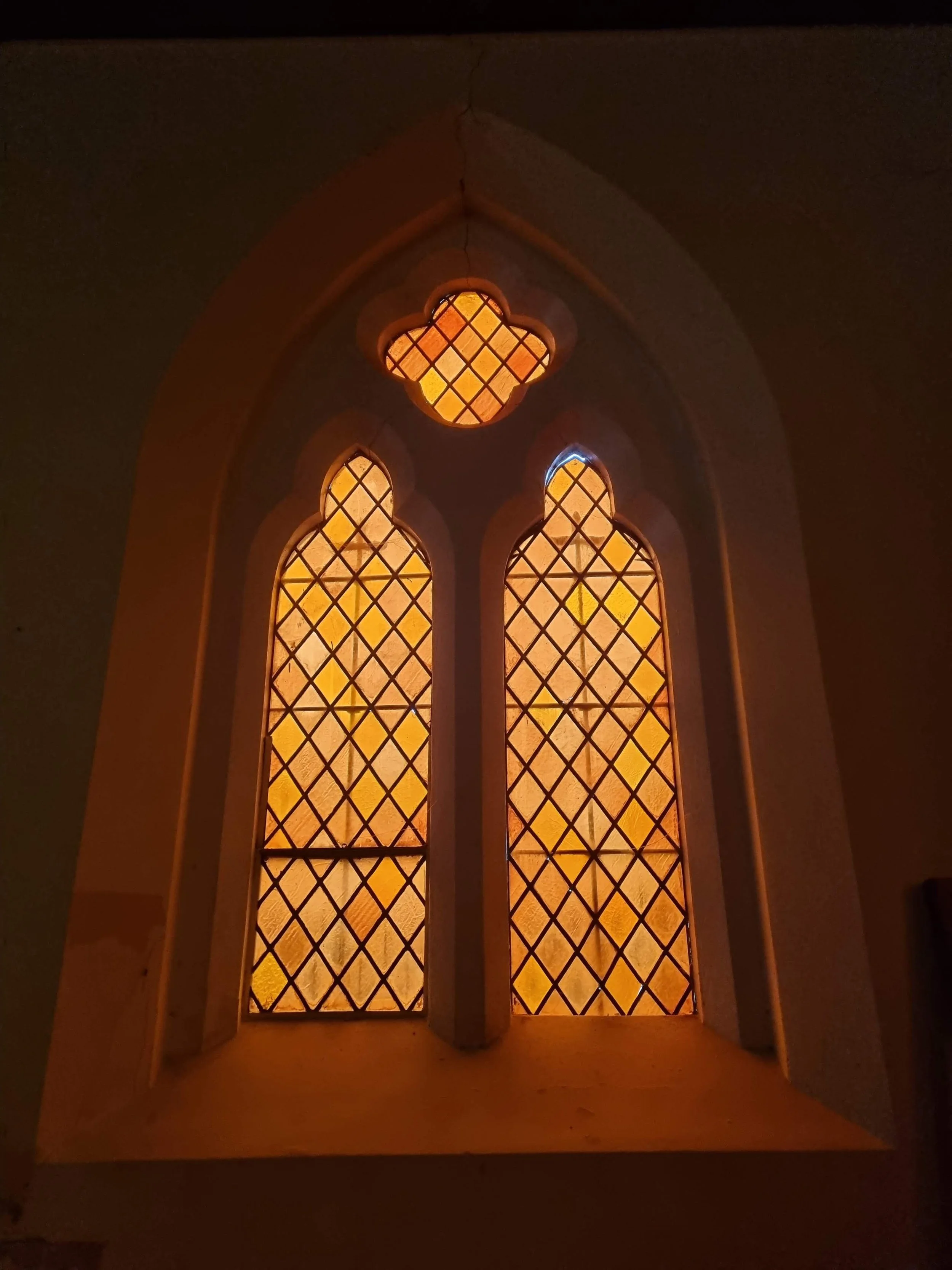
A circular stair rises to the mezzanine. From there, a Juliet balcony looks back down into the church space below, framing the stained glass windows that remain exactly where they always were. Coloured light still moves across the floor in the afternoon. That hasn't changed. New bathrooms are resolved in materials that hold their own against the bluestone fabric without competing with it. Recycled heritage doors are used throughout. Nothing feels imported or imposed. What this project required was restraint. The temptation with a building this strong is to respond too loudly.
Every intervention here was made quietly, with the understanding that the building had already done most of the work.
The transformation of a derelict corner shop in inner Melbourne into a three-level home that seamlessly integrates urban living with nature. This intervention breathes new life into the site while preserving its historical character, creating a sanctuary of greenery within a dense residential context.
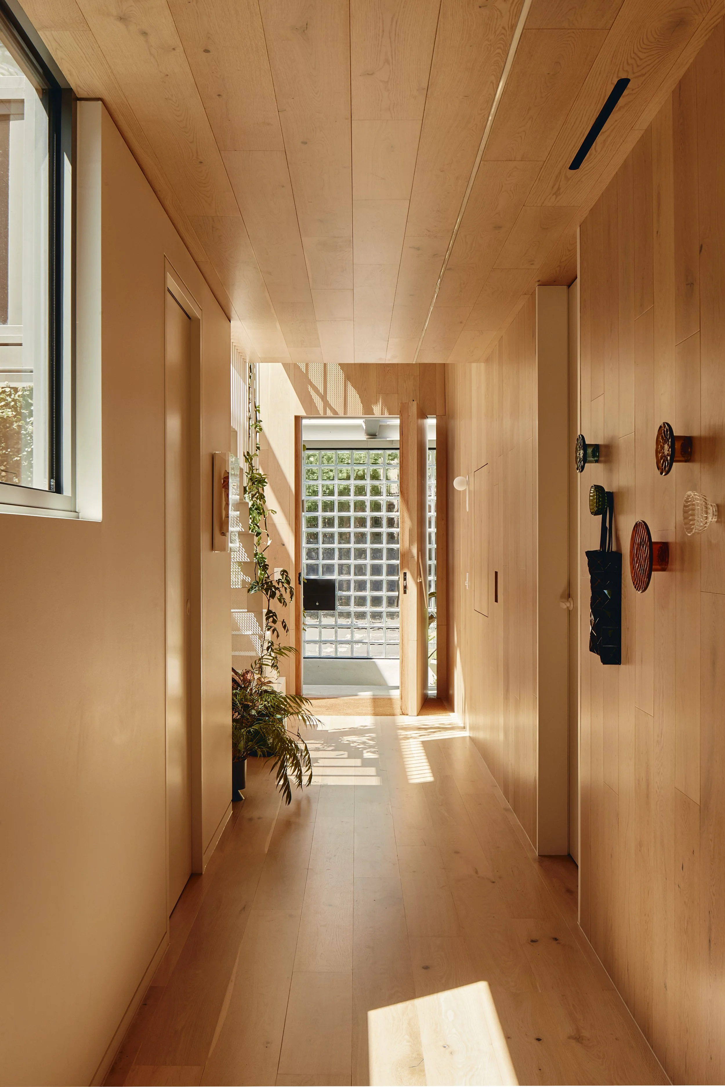
The design approach celebrates the existing character of the original corner shop while reinterpreting it for modern living. The shopfront façade is preserved and subtly modified, with glass blocks replacing traditional windows to enhance privacy while allowing diffused light and glimpses of the lush garden courtyard. Entry through the former milk bar door transitions visitors into an immersive green oasis, establishing an immediate dialogue between built form and nature.
The spatial organization is defined by a series of setbacks and lightwells that create layered planning and optimise natural light penetration. Each level incorporates biophilic elements, including courtyards, green roofs, vertical gardens, and an internal green screen. These features blur the boundaries between interior and exterior spaces, fostering a dynamic interplay between architecture and the natural environment.
The project merges the 287m² corner shop site with an adjacent 90m² residential lot to form an urban retreat. The resulting garden oasis serves as a central design element, softening the building's presence within its urban context. A white mesh staircase connects all three levels, illuminated by triangular skylights inviting natural light deep into the home. This vertical axis becomes a visual and functional centerpiece, enhancing spatial connectivity. The third level offers sweeping treetop views and sightlines to Melbourne's city skyline, creating a sense of openness and connection to the broader urban fabric.
Natural materials are employed throughout the home to reinforce its connection to nature. Timber cladding wraps interior surfaces, adding warmth and texture while echoing biophilic principles. Openings are strategically placed to frame views of greenery, ensuring constant interaction with the surrounding landscape.
At its core, this project exemplifies how architecture can harmonize built environments with natural systems. By integrating greenery into every aspect of the home, it dissolves traditional boundaries between indoor and outdoor spaces. The result is a residence that fosters well-being, enhances livability, and redefines what it means to live sustainably in an urban setting.
This transformation is not just about adaptive reuse, it is a celebration of heritage, innovation, and the enduring relationship between people and nature in architectural design.
A mid-century home restored to the discipline of its own language. The intervention works with the existing geometry and material palette, reintroducing precision where time had softened it, and adding contemporary detail that respects rather than competes with the original.
The bones were good. The problem was everything the walls were keeping out.
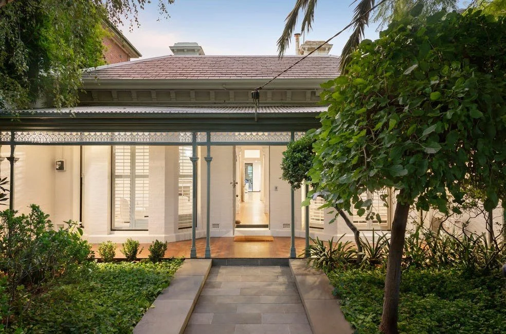
This single-storey Victorian terrace in St Kilda had the street presence, the original fabric, the proportions. What it didn't have was light in the centre, air moving through it, or any connection to the ground from the rooms that needed it most.
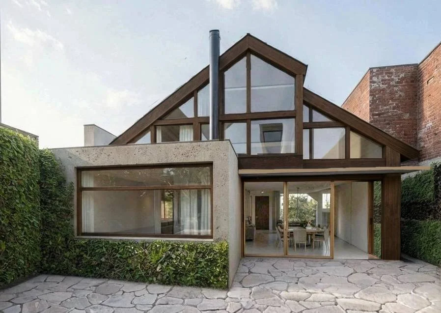
The work stayed entirely within the existing wall boundaries. Nothing was added to the footprint. Instead, two courtyards were cut into the heart of the plan. That single move changed everything. Full-height glazing wraps both courtyards. Light drops into the centre of the house from above and from the sides. The rooms that were once the darkest are now oriented around planted space. Ventilation moves through the plan naturally.
The courtyards are not outdoor rooms appended to the back of the house. They are inside it, surrounded by it, visible from almost everywhere within it.
Behind the single-storey front, the roofspace remains opened up into a mezzanine level. A new staircase rises through the section, light enough to read as floating within the volume.
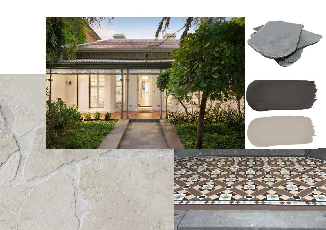
From the mezzanine, the relationship between levels and the two courtyard gardens below becomes clear. The house has a vertical life it never had before. Materials hold the balance between raw and refined. Timber cladding. Light bronze doors. Textured crazy paving underfoot, tactile and grounded.
Contemporary finishes sit alongside them without friction. Nothing is trying too hard in either direction. The Victorian envelope is intact. The street sees nothing different. Inside, it is an entirely different house.
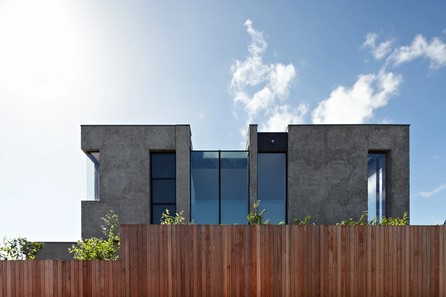
This contemporary extension on a double suburban block sensitively integrates contemporary family living with the original home’s Modernist beginnings.
Embodying biophilic principles to enhance connection to landscape, the design blurs the distinction between the existing and new elements to create a unified architectural entity.
A key strategy to achieve this seamless impression was to stretch the original concrete façade away from the existing building to form the ‘skin’ of the master retreat. Beyond this, versatile spaces feature easy transitions from public to private zones, inside and out.
The prevailing aesthetic is a nuanced balance of old and new, with the original features retained and echoed in new fittings and finishes. Sustainable features, including skylights, double glazing and solar panels, have been adopted throughout.
Eschewing conventional strategies has resulted in a home that is able to flex with its owners’ lifestyle and allows them a greater work-life balance.
Photography: Peter Bennetts
In bayside Mount Martha, this single-storey holiday residence is a serene sanctuary enveloped by nature.
Briefed to create a multi-generational family retreat, Kister Architects deftly designed distinct zones for privacy and entertaining, with an interplay of openness and enclosure, solidity and transparency.
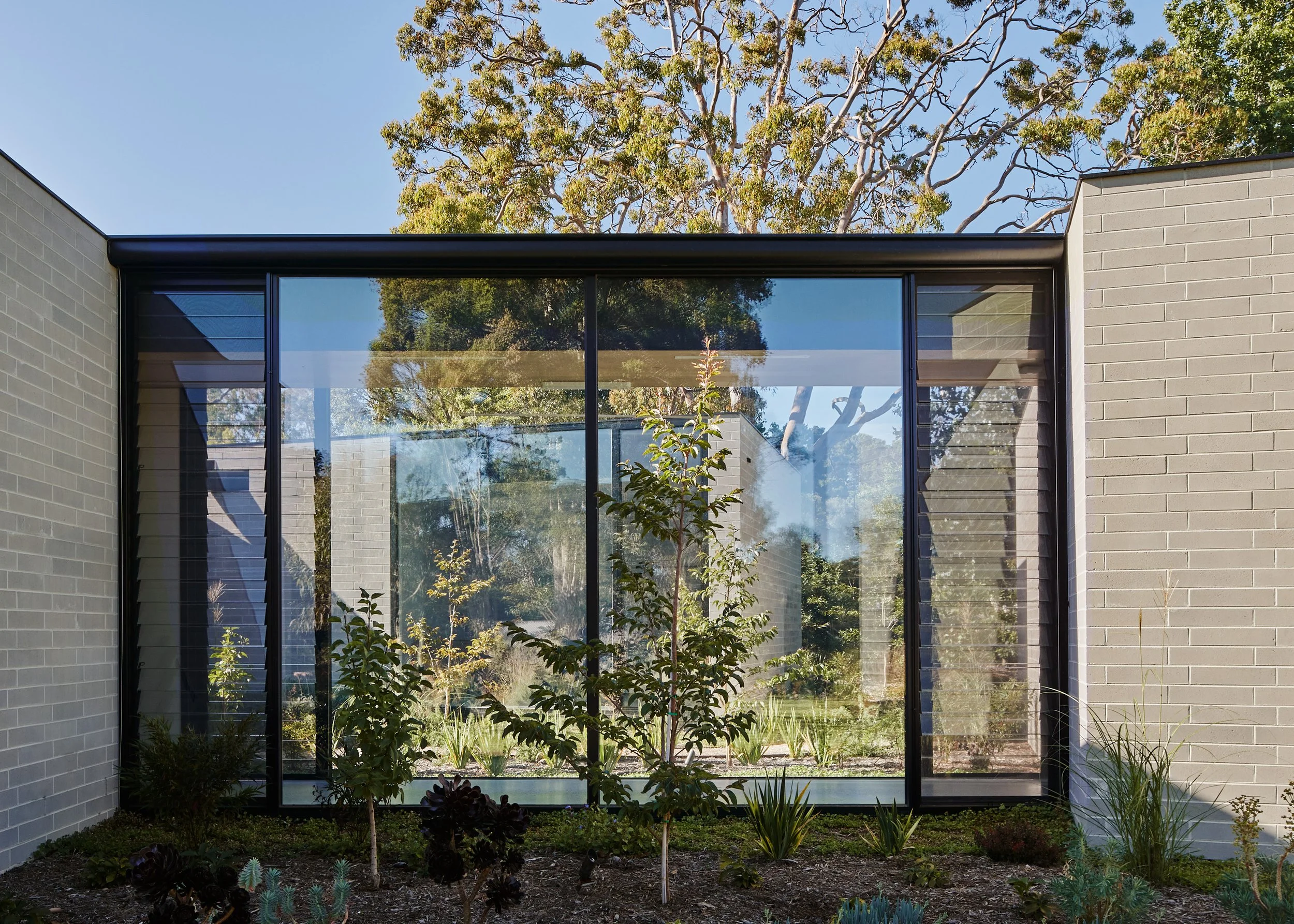
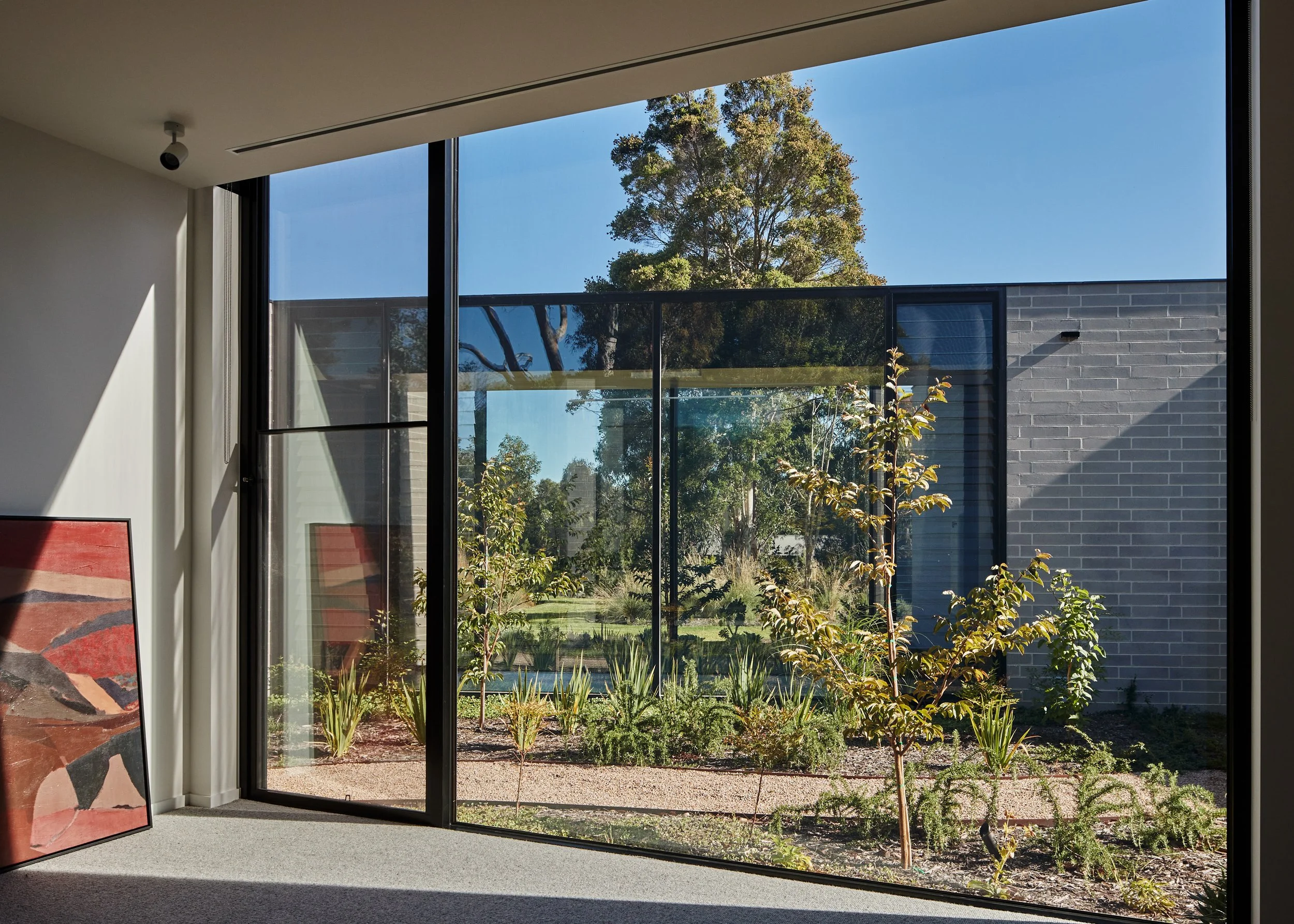
Biophilic design principles underpin the seamless integration of interior and exterior. Considered siting exploits the northerly aspect and locates a triangular plan around a central courtyard to maximise the penetration of natural light year-round.
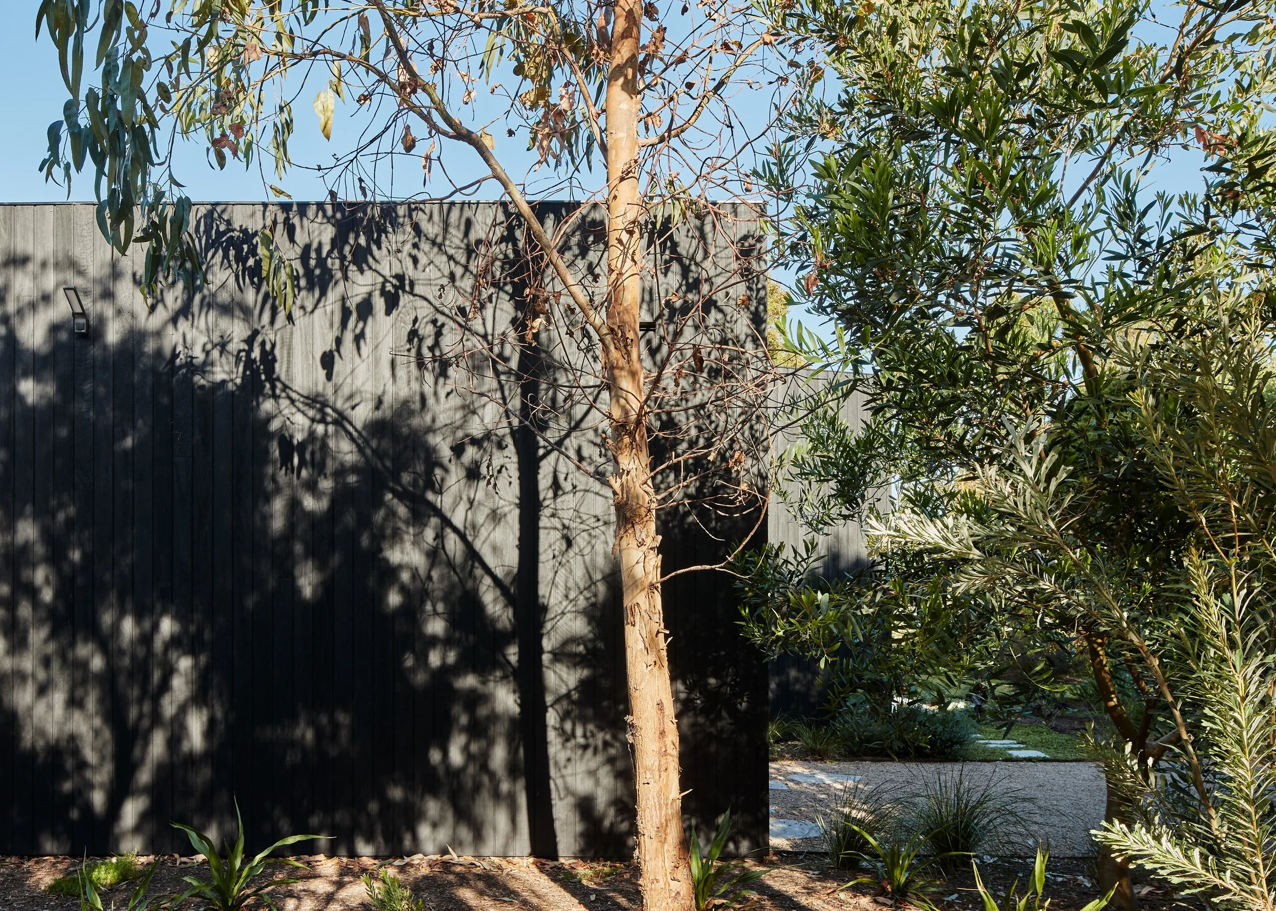
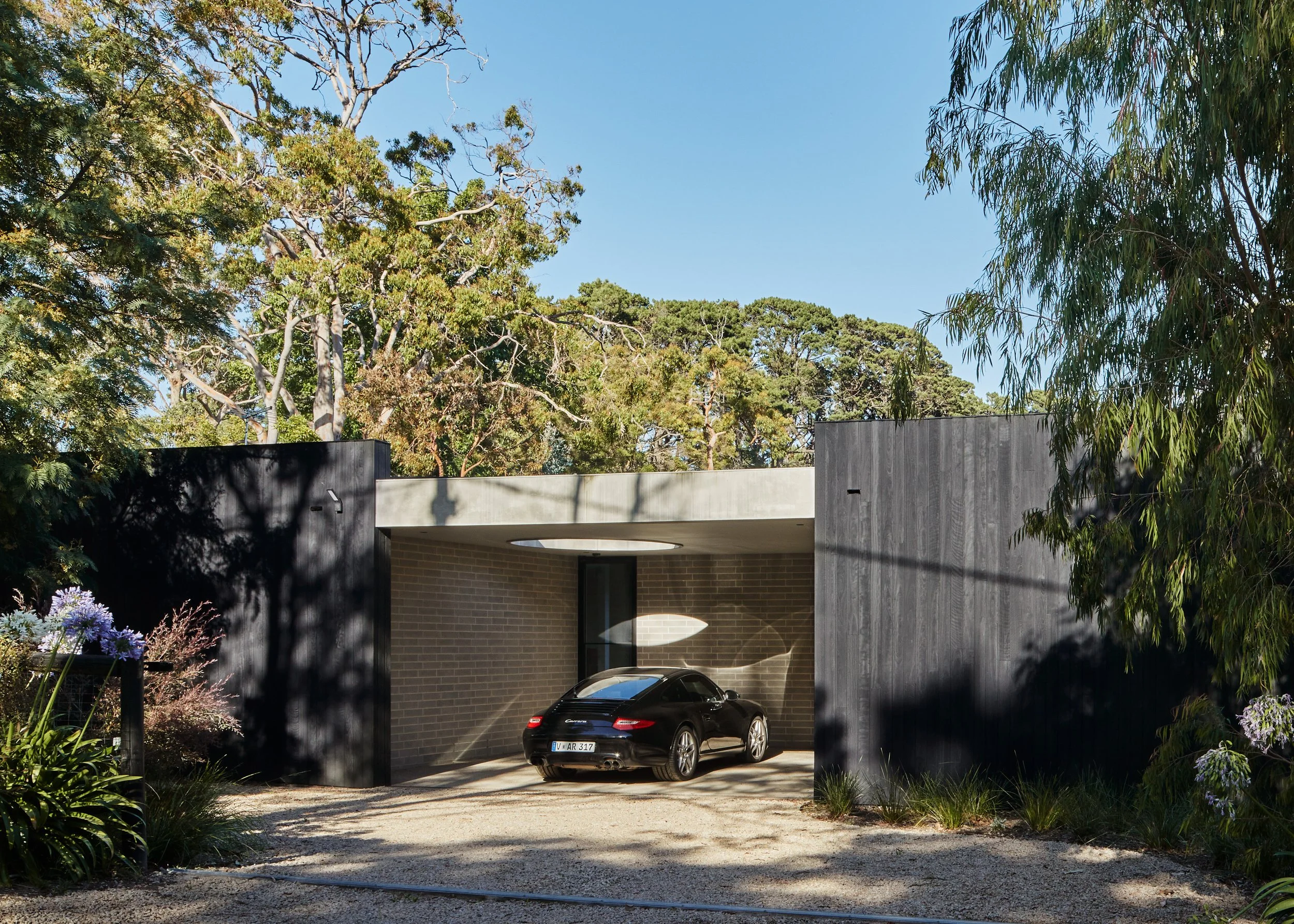
A high, charred-timber wall shields the home from the street before peeling away to reveal a covered entry, beyond which lie the main volumes. The natural material selection is continued throughout, highlighted by natural light, while the pergola and central courtyard create an everchanging play of shadow and light.
Founded upon sustainable principles, every element – from louvred windows for cross ventilation to solid blockwork for thermal mass – deliberately serves a functional and aesthetic purpose.
Photography: Peter Bennetts
A 19th-century church, deconsecrated and emptied of its original purpose, becomes a private urban sanctuary in the heart of Collingwood. The intervention is restrained: a new kitchenette, library, and powder room are inserted in black and mirrored finishes that recede in deference to the existing volume, allowing the original detail of the building to reassert itself. A new deck and garage resolve the practical requirements of contemporary living without diminishing the spatial authority of the heritage shell.
Photography: Peter Bennetts
“We thoroughly enjoyed the process of working with Ilana on the renovation of our house – a deconsecrated 19th century church. It was an extremely positive collaboration as Ilana involved us in all aspects of her design. Her vision paid homage to the cultural significance of the property, yet it now has all the comforts and efficiency of contemporary functionality. The renovation was completed in a timely fashion and was kept within budget. I have no hesitation in recommending Ilana’s services.”
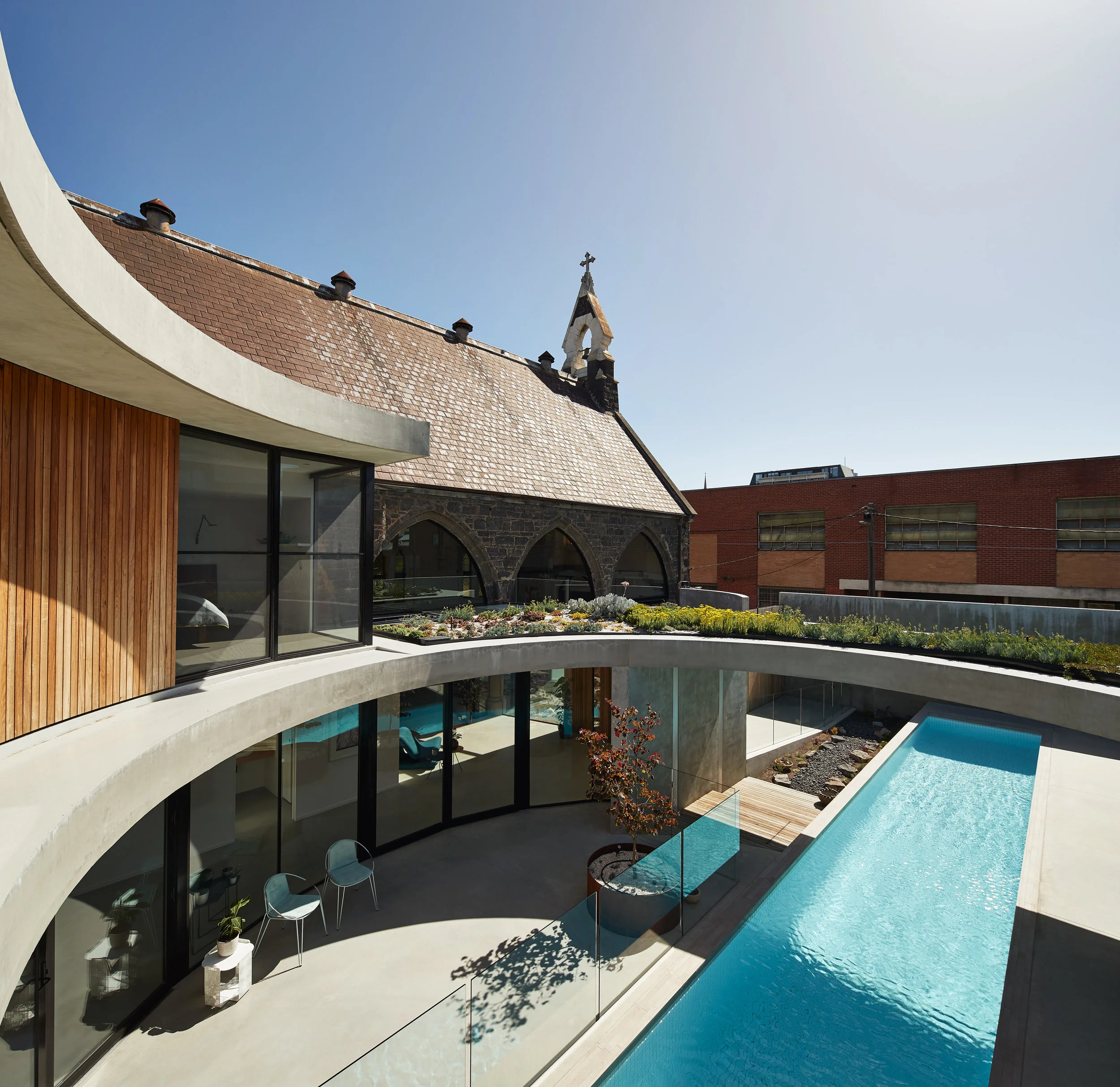
The Courtyard House encompasses both a new build and a conversion to the modest St Saviour’s Church in inner-city Collingwood. With its dense composite of residential conversions and developments within mixed-use industria, this context provided an architectural opportunity to rethink the family home while incorporating a former place of worship.
The owner-architect’s brief was to create a private sanctuary for a family of five within this urban hub. Implicit in this was the versatile utilisation of the church space.
As a primary response, the approach was to maximise the site footprint and northern orientation to create a seamless integration of old and new, interior and landscape.
High perimeter walls create an immediate sense of enclosure and proportionate scale to the church and nearby buildings. Where a curved plane of concrete in this facade peels away along the street front, a concealed entry opens into a vast outdoor courtyard, dominated by a 17-metre lap pool and concrete canopy above.
The church rises to the right, while at ground level it is sensitively connected to the new construct via a glass link. This is a pivotal point; more than a physical connection, it is a symbolic link between old and new, a subtle transition into the former place of worship.
Similarly connecting the old and new, the circular courtyard is the site’s focus. Raised to the ground plane of the built elements at upper-street level, its form is a nod to Ground’s Hill St house. In the courtyard’s creation, the standard house cube has been cut away and, where it thins to an horizontal plane, the resultant canopy creates a sharp linear contrast to the rounded forms.
Orientated to this courtyard, the home’s living areas on both levels are flooded with northern light, which generates a play of light and shade within and blurs the boundaries between inside and out. The upper level is set back and overlooks the courtyard and a roof garden. The clarity of detail and pared back finishes throughout create a clean Modernist aesthetic that elicits a sense of calm, in contrast to the bustle of the urban surrounds.
An extensive use of concrete in this new addition both complements and contrasts the existing church fabric, while original windows and bluestone footings have been reintegrated into the new building and landscape in considered ways.
The church itself has been stripped back to its core structural elements. By demolishing the apse and bricked archways, and inserting glazing instead, its formerly dark interior is flooded with light and celebrates the building’s historic beauty and volume.
Sustainable principles have been adopted throughout: skylights and internal windows allow natural light into internal spaces, reducing the need for artificial light; heat gain is controlled through canopies, double glazing and blinds; the courtyard allows continuous cross ventilation; and, the thermal mass of exposed ground slab, coupled with appropriate insulation, helps to regulate the internal environment in all seasons. The rooftop garden provides insulation, softening the exterior aspect and attracts wildlife in this urban location.
Photography: Peter Bennetts
A new home built on a tiny site for empty nesters.
This is a courtyard house built to capture the light. Set on a 270m2 site, the living spaces open to the North and West to maximise garden courtyards and natural light.
This project uses cladding that is better than carbon neutral, solar energy for hot water and electricity, water tanks for irrigation, thermally broken window frames, low emission glazing and extensive insulation.
Dear ilana,
We want to let you know how pleased we are with the house. With some furniture and paintings and a growing garden (lots of roses), the house looks lovely and the few days that we spent in the house gave us much pleasure.
Kind regards, and thank you again.
Sonia and John
This home is testament to a 6 year journey of perseverance and determination (not to mention love) by architect, client and builder!
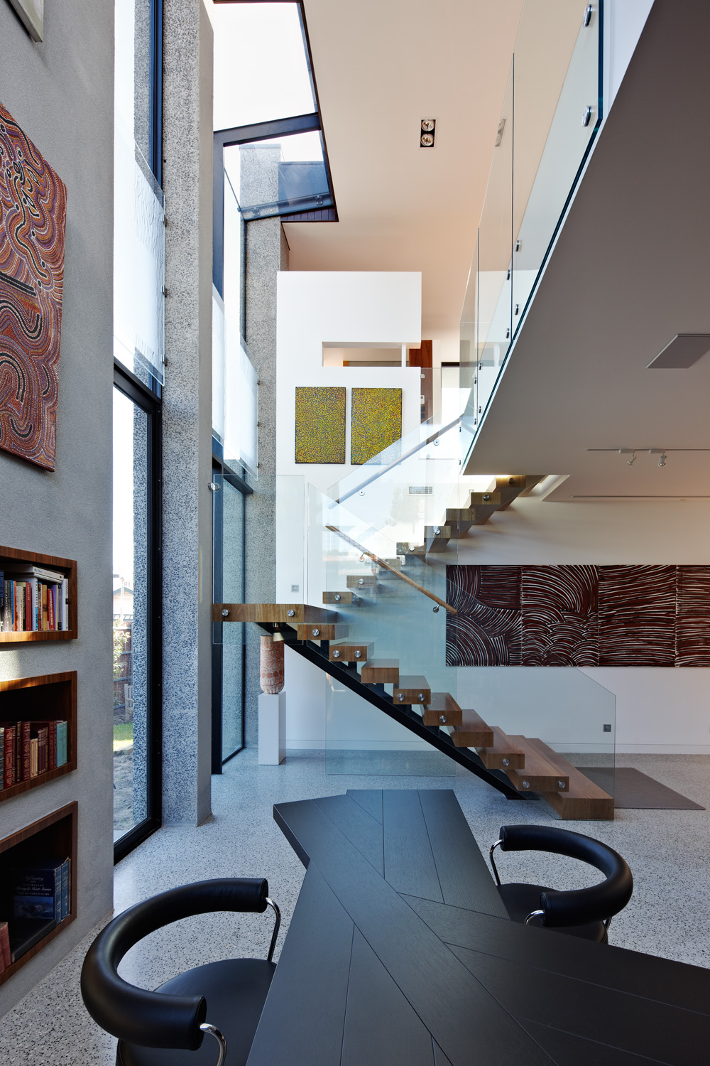
The project posed an interesting challenge from day one: to design a contemporary space for a fabulous art collection and a home for entertaining, framing a view of Melbourne's CBD in a dense inner city location.
The corner site (allowing great opportunities as well as constraints) had a heritage overlay whilst the house little to no heritage significance.
What began as a renovation project in town planning, ended up in a VCAT mediation, followed by two VCAT hearings and was finally awarded a permit after 3 years. The early stage of construction exposed structurally unsound remains. After much negotiations and compromises with council, a permit was issued to build from new.
Our project began in May 2005 and my clients moved in August 2011.
The residence was driven by my clients’ extensive art collection, the local typology and the ever-changing Melbourne skyline. Our outcome is a space designed to double as home and art gallery.
Photography: Peter Bennetts
“We have built 2 houses with Ilana’s design, one an urban home on a small site on the city fringe and a second in a country setting on a larger site.
Both houses reflect perfectly their setting and respond to the brief Ilana was given to suit each location. We love both houses and reside comfortably in each. Ilana has successfully managed to meet our requirements to achieve this outcome.
We found working with Ilana to be smooth and uncomplicated. She is efficient and is flexible when this is needed and works compatibly with builders, contractors and tradesmen.
In summary Ilana is easy to work with, innovative and responds well to the brief bringing her aesthetic to ours to achieve the desired outcome.
We are very happy to recommend her architectural services. “
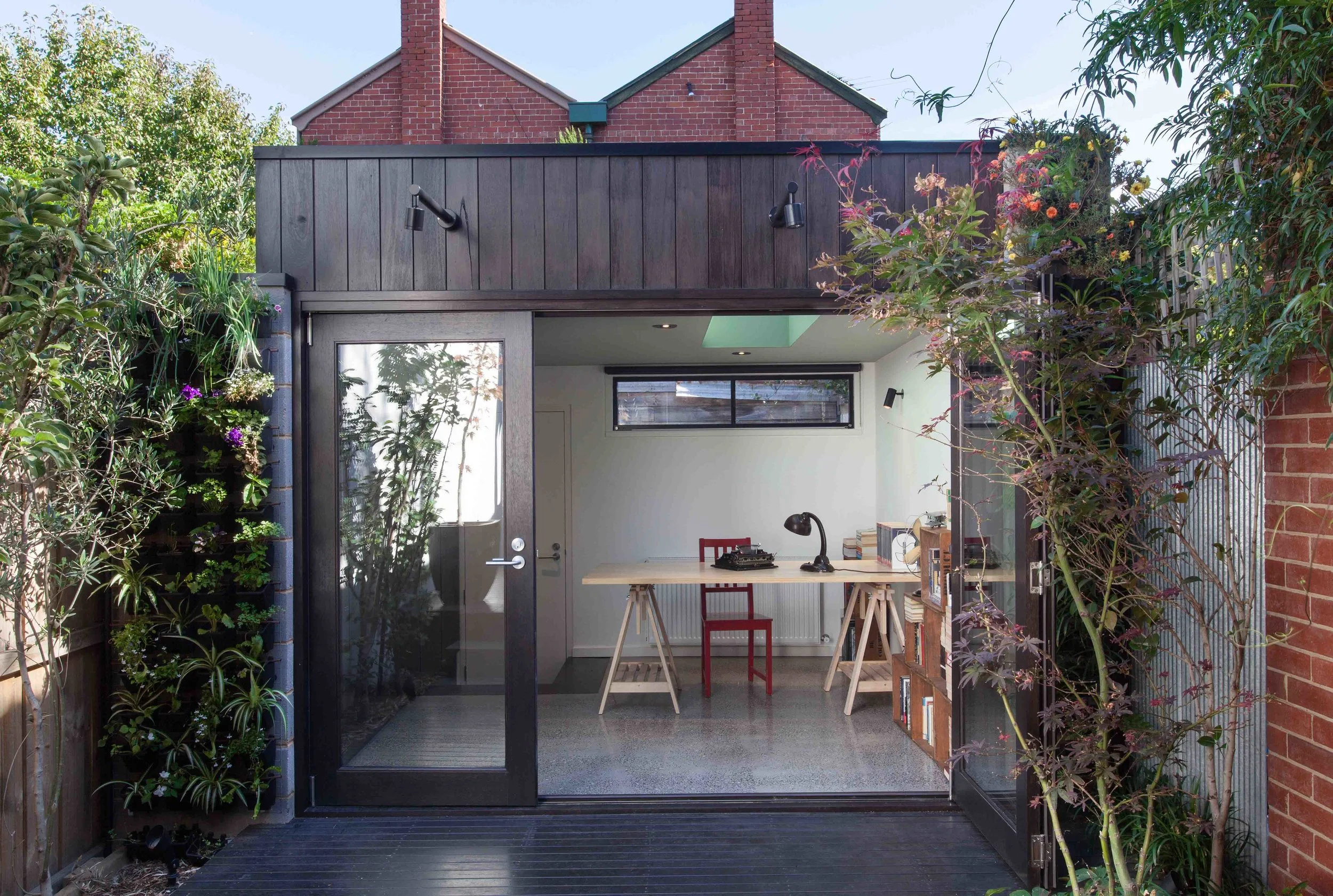
Located on a small site in South Melbourne and covered by a heritage overlay, this project pushes the Rescode boundaries. This project began as an extension to a worker's cottage frontage (Victorian red brick) in 2001.
After 11 years the owners returned with 2 grown up kids with no space to move. We designed a small studio/office on the rear of the property and relocated the garden up onto the roof.
Photography: Michelle Williams
Located on a small site in South Melbourne and covered by a heritage overlay, this project pushes the Rescode boundaries. It was necessary to build a shell to contain the new 3 storey rear extension. The back opens out with large pivot doors to maximise entertaining space. The completed works respond to the brief, "build as much as possible", and balance the solidity of the existing worker's cottage frontage (Victorian red brick).












![HO40_GlenEiraPS_Craigellachie_19 [LR].jpg](https://images.squarespace-cdn.com/content/v1/5b59145bb27e39b6d9d02113/1689827947573-B5PEDYAI4QL2SH48IXUF/HO40_GlenEiraPS_Craigellachie_19+%5BLR%5D.jpg)
![HO40_GlenEiraPS_Craigellachie_37 [LR].jpg](https://images.squarespace-cdn.com/content/v1/5b59145bb27e39b6d9d02113/1689827951895-0PPDU1AJC8E5MN8IVGGD/HO40_GlenEiraPS_Craigellachie_37+%5BLR%5D.jpg)
![HO40_GlenEiraPS_Craigellachie_61 [LR].jpg](https://images.squarespace-cdn.com/content/v1/5b59145bb27e39b6d9d02113/1689827956715-MHD9RSQK5K2TD2V33AJM/HO40_GlenEiraPS_Craigellachie_61+%5BLR%5D.jpg)
![HO40_GlenEiraPS_Craigellachie_69 [LR].jpg](https://images.squarespace-cdn.com/content/v1/5b59145bb27e39b6d9d02113/1689827961570-WM45OPGM6O3RFHGC6VQS/HO40_GlenEiraPS_Craigellachie_69+%5BLR%5D.jpg)
![HO40_GlenEiraPS_Craigellachie_70 [LR].jpg](https://images.squarespace-cdn.com/content/v1/5b59145bb27e39b6d9d02113/1689827962425-F9G7DVRWZ6A8H4LF9SD0/HO40_GlenEiraPS_Craigellachie_70+%5BLR%5D.jpg)
![HO40_GlenEiraPS_Craigellachie_78 [LR].jpg](https://images.squarespace-cdn.com/content/v1/5b59145bb27e39b6d9d02113/1689827969424-WL916AJDGKNS17SEEKEG/HO40_GlenEiraPS_Craigellachie_78+%5BLR%5D.jpg)
![HO40_GlenEiraPS_Craigellachie_85 [LR].jpg](https://images.squarespace-cdn.com/content/v1/5b59145bb27e39b6d9d02113/1689827979354-WTR8ROBSXF4ULTXN4NIT/HO40_GlenEiraPS_Craigellachie_85+%5BLR%5D.jpg)
![HO40_GlenEiraPS_Craigellachie_74 [LR].jpg](https://images.squarespace-cdn.com/content/v1/5b59145bb27e39b6d9d02113/1689827966246-KDPO2V5F0VMNBI64TRGI/HO40_GlenEiraPS_Craigellachie_74+%5BLR%5D.jpg)
![HO40_GlenEiraPS_Craigellachie_88 [LR].jpg](https://images.squarespace-cdn.com/content/v1/5b59145bb27e39b6d9d02113/1689827980611-EHQUMK9TWQQ3437IM4XY/HO40_GlenEiraPS_Craigellachie_88+%5BLR%5D.jpg)
![HO40_GlenEiraPS_Craigellachie_5 [LR].jpg](https://images.squarespace-cdn.com/content/v1/5b59145bb27e39b6d9d02113/1689827945883-7S1HICASBQT9YVRTSGAB/HO40_GlenEiraPS_Craigellachie_5+%5BLR%5D.jpg)
![HO40_GlenEiraPS_Craigellachie_50 [LR].jpg](https://images.squarespace-cdn.com/content/v1/5b59145bb27e39b6d9d02113/1689827952855-JS6BZ4FSYXVZU8ZAQXA9/HO40_GlenEiraPS_Craigellachie_50+%5BLR%5D.jpg)
![HO40_GlenEiraPS_Craigellachie_63 [LR].jpg](https://images.squarespace-cdn.com/content/v1/5b59145bb27e39b6d9d02113/1689827957544-08OLV77DJPH0WXACC9C1/HO40_GlenEiraPS_Craigellachie_63+%5BLR%5D.jpg)